
This is still early days, but it’s starting to come together. My major reservation is that it looks a little – familiar. I’m a bit worried I may be unconsciously imitating another font I have seen. It has a certain T26 vibe.
This is still early days, but it’s starting to come together. My major reservation is that it looks a little – familiar. I’m a bit worried I may be unconsciously imitating another font I have seen. It has a certain T26 vibe.
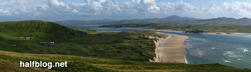
Another late night progress report for ‘my’ Doctor Who font. Mostly subtle tweaks, but these usually take the longest. There’s still a lot I’m not keen on, in Particular the V. Both Y‘s are ugly, but I’m fairly happy with the current G and Q situation.

I’m open to constructive criticisms and suggestions at this point.
![]()
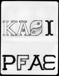
Progress report for day two of the ‘Geronimo!’ Doctor Who font experiment. Most of it is basically there, but I’m pretty unhappy with some of the details. Nothing like kerning has even been attempted here, this is literally just so I can see how the whole alphabet looks.

Now I need to work on how to make the difficult characters (B, G, Q, Y, V) work, and what, if anything, I can do to improve the bland characters (E, F, S, Z).
I still plan to do numbers and some of the more essential special characters(“, &, #, ~, @, +, – and parentheses).


This evening I’ve been playing around in Inkskape, trying to reproduce the typeface used in the new Doctor Who logo. If I finish it, I’ll set it free on the internet for the Whovians to play with. I picked it mostly because it’s a nice simple design. I plan to call the font ‘Geronimo’.
![]()
On closer inspection, I’ve started to take a strong dislike to this new logo. I find the ‘DW’ TARDIS shape to be huge and ugly, but even the letters themselves seem to have some funny issues. Look at the third slide attached to this post, or go and find a larger version of this image on the BBC site. The H‘s right leg is thicker, and the O is not symmetrical vertically! The W is just so ugly I’m reluctant to draw it, and I have no idea why they made the R like they did.
Anyway, I’m going to be faithful to what they’ve done here, but I’ll probably build in an alternate character set with my own ‘improvements’.
Today’s daily design is an icon of an old cassette tape. I’m making the actual SVG vector file available with this post in an attached ZIP file (I think Posterous does something sensible with those!)*. I consider it free to use for any non-profit reason.
It generally follows the principles of the Tango icons, commonly used on Linux’s Gnome desktop, but I haven’t exactly paid close attention to their guidelines.

* Note 2011.10.13: This post was written at a time when this blog was hosted on Posterous, who offered hosting for small data files like this. Leave a comment if you want a copy of this icon, and I’ll Dropbox it for you.

Conceptually this one is a bit weak, but this is a technique I’ve been wanting to try for a while. I wish I had put a bit more personality into the poses, especially the 6 who should at least be shaking his fist!
The robots already existed, but the rest of the composition and rendering took exactly an hour.

Feeling rough, I called in sick today. On the plus side, I got to spend a bunch of time tweaking today’s daily design. I’m quite pleased with the stick-robots, so may use them again!

Today’s daily design makes use of my earlier penguin cartoon, and adds another little guy who looks like he wanted a bath. I’ve tried to reference a little of the style of old-school animations, by making it look like the background was painted on a separate layer. Sadly, the direction of light is inconsistent on these two because I drew the smaller chap facing the other way and flipped him at a later stage, when I didn’t have the time or inclination to redraw the shadows.
I know: excuses, excuses.

A bit of a cheat today – this design wasn’t created entirely this evening. In fact, it’s about three evening’s work (see other posts from last September).
Tonight, I changed the eyebrow so he looks less angry (I actually preferred that look, but had several negative criticisms), finalised the palette using a nice scheme from Colour Lovers and added a bit of canvas texture in GIMP.
Of course, I’m not the only one doing these daily designs – check out ‘Of Science and Beauty‘ for some really nice science themed illustrations.

This was one of those designs where I had the basic concept nailed in ten minutes, and then spent ages refining it. I’m still not entirely satisfied, but happy enough to leave it here. That said, I may revisit this in another daily design and produce a magazine cover or something.

Smashing Magazine has an article encouraging designers to produce a something every day. This is my first effort. I was ‘inspired’ by the recent Doctor Who finale, and by Comicraft‘s big font sale (which is still on as I write this, so act quick if you want some great fonts for only $20.10).
I expect I’ll be using my new fonts for later designs!

Made some progress on this tonight, mostly just adding the grass to imitate the Welsh flag a bit more. Still not finished though.

A simple mashup of the Twitter cartoon bird identity and 'Y Ddraig Goch' that appears on the Welsh flag. It’s not finalised yet, but it’s nearly there. When I look at it again in a few day, I’ll probably spot exactly what needs to be tweaked to make it just right. Of course, feedback at this stage is often useful too. :)
I’m thinking about putting him on a grassy backdrop, to imitate the Welsh flag even more.
![]()
I’ve been slightly tweaking a nice WordPress theme to use for my blog, and I wanted to use some nice minimalistic icons. I had in mind the excellent Picol project icons, but on closer inspection they were a bit mismatched and when I saw them in place they looked like they had come from several different icon sets.
So these were heavily inspired by Picol, but a little more rounded and consistent with each other. The set took less than an hour.On and off for the last week I have been experimenting for pretty much the first time with some icon designs for an Openbox logout script being written by Nik_Doof for #! CrunchBang Linux.
I’ve attached a screenshot below of the 0.1 release in action, as well as some alternative icons. I plan to revamp the icons: I’m going to try a set making better use of PNG transparency, and also provide a smaller size (64×64?). Of course, I’ll also make the SVGs available in due course.
Any feedback is welcome!


I’ve spent this evening working on a cartoon penguin in Inkscape. I’ll release this with a liberal Creative Commons licence and as an SVG when I’m sure I’m happy with it. I’ve also attached my work in progress for those who may be curious. Any constructive criticism is welcomed. :)

Inkscape is an Open Source vector graphics editor, with capabilities similar to Illustrator, Freehand, CorelDraw, or Xara X using the W3C standard Scalable Vector Graphics (SVG) file format. Supported SVG features include shapes, paths, text, markers, clones, alpha blending, transforms, gradients, patterns, and grouping. Inkscape also supports Creative Commons meta-data, node editing, layers, complex path operations, bitmap tracing, text-on-path, flowed text, direct XML editing, and more. It imports formats such as JPEG, PNG, TIFF, and others and exports PNG as well as multiple vector-based formats.
