The infographics of xkcd

Log scale 
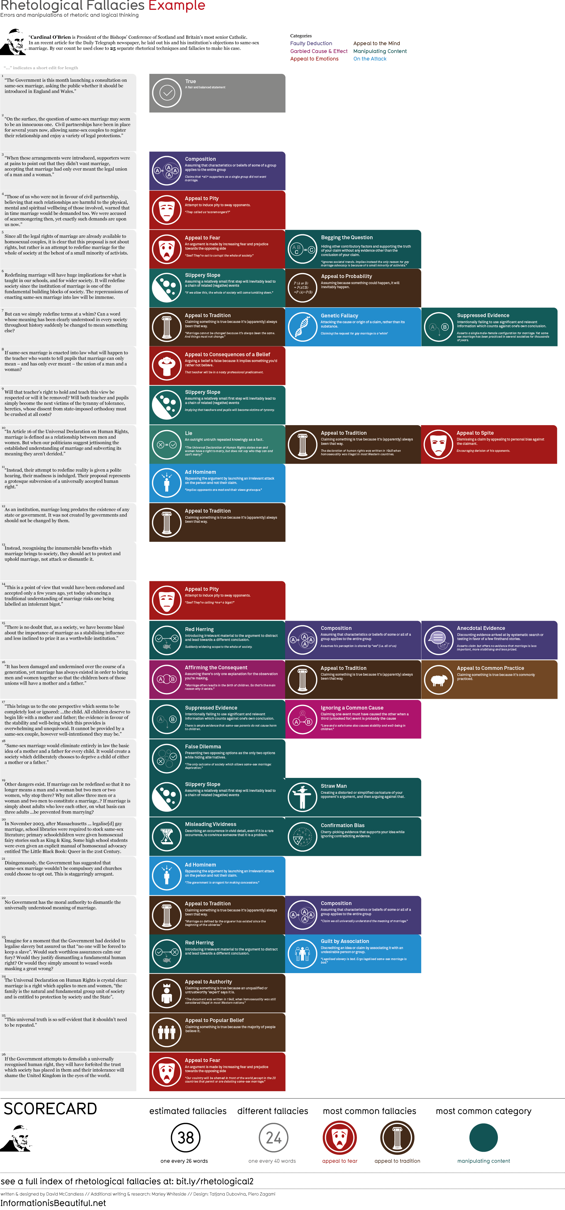
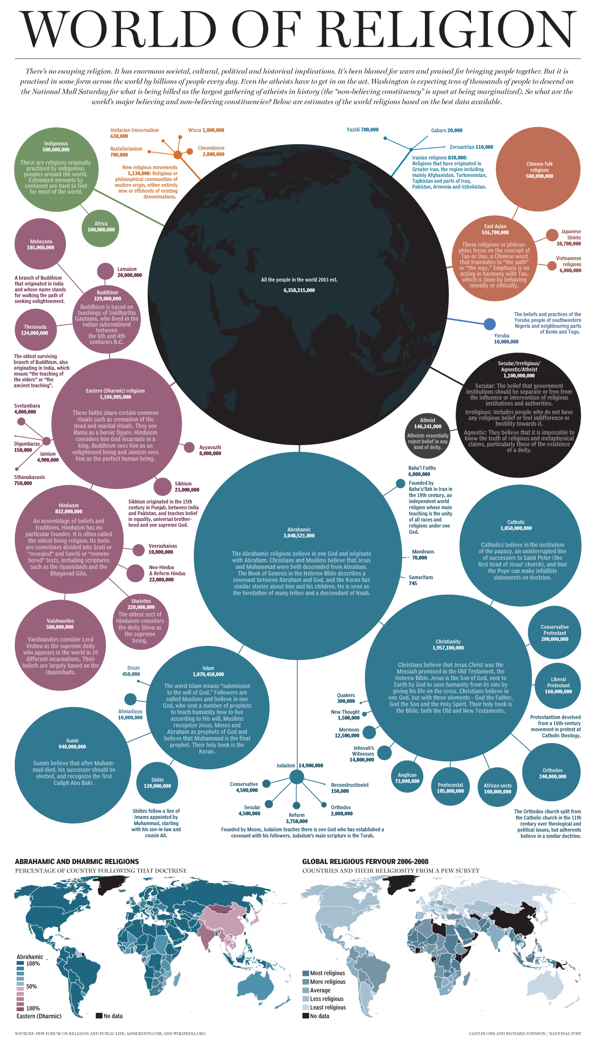
Most infographics on the web consist of generic graphics backed up with (lots of) poorly researched text.

When done well these informational graphics use charts, diagrams and illustrations to make complex ideas easier to comprehend. At their best the results can be quite illuminating.

Randall Munroe has produced more than a few great infographics for xkcd. His infographics can be broken down into three rough categories:

  1. Pure gag charts,
  2. Jokey graphics with a serious point, and…
  3. Well-researched highly informative graphics with some jokes sprinkled throughout.

For this post I’ve compiled the more informative types. There’s a list of some (but not all) of xkcd’s novelty graphs and charts at the end of this post.

For science! →

Advertisement

The Up-Goer Five Text Editor (and how to use it for SEO)

Up Goer Five is one of Randall Munroe’s more famous recent xkcd infographics in which he attempts to describe the workings of a Saturn V rocket using only most commonly used 1,000 words in the English language. Here’s just a part of it:

Up Goer Five, cropped

Inspired by this, The Up-Goer Five Text Editor is a fun tool (created by Theo Sanderson) that restricts the user to just the same 1,000 words. Anything not in that tiny dictionary will be given familiar squiggly red underlines.

The Up-Goer Five Text Editor

The Up-Goer Five Text Editor

Scientists have been trying to explain the work they do using only this reduced language. Here’s the work of a paleontologist summarised:

I study tracks, trails, places where animals make homes, and shit, both new and old, and figure out how animals do these things.
Tony Martin, paleontologist

Some of these passages come across as quite patronising (“We burn dead black stuff so that we can build things, power our houses and make our cars go.”), but some of the better ones are quite poetic. io9 has a beautiful description of Saturn:

There is a world that goes around the sun, ten times farther away from the sun than the world we live on. This world is really big – about ten times as wide as our world – and most of it is thick air pulled tight together. It has big beautiful rings around it, made of many pieces of ice.
A loving upgoerfive intro to Saturn and some of its moons, by Rachel Klippenstein

It’s worth reading the full thing.

What does this have to do with SEO? →

Halfblog: 2012 in review

WordPress fireworks WordPress.com has produced some cool-looking reports for users, summing up blog activity for 2012. It’s really just a pretty stats page, but it’s very well done with CSS animated fireworks, parallax effects and colourful graphics. You can see the complete report for halfblog.net here.

Here’s the summary it provided:

19,000 people fit into the new Barclays Center to see Jay-Z perform. This blog was viewed about 130,000 times in 2012. If it were a concert at the Barclays Center, it would take about 7 sold-out performances for that many people to see it.

In 2012, there were 133 new posts, growing the total archive of this blog to 657 posts. There were 306 pictures uploaded, taking up a total of 91 MB. That’s about 6 pictures per week.

The busiest day of the year was September 24th with 754 views. The most popular post that day was Minimalistic iPhone 5 wallpapers.

Continue reading

11 reasons your infographic isn’t an infographic

Ian Lurie demolishes crap infographics:

OK everyone. Take a deep, freaking breath. I can’t sneeze right now without spraying germs on someone’s attempt at a data-driven work of art.

Here’s why the poster you paid someone $400 to make isn’t an infographic:

  1. Lack of clarity. Infographics should ease and speed the consumption of information. If you take something you can express in 25 words and turn it into 1000 x 3000 pixels of eye-watering garbage, it’s not an infographic. It’s a waste of paper.
  2. Lack of data. Infographics used to communicate data. Like this. Now, apparently, I can turn a fax machine manual into a poster and get it posted to 55 different infographics directories. Retch.
  3. Low information density. An infographic is more effective than words describing the same subject. Otherwise it’s art. Which is cool and all. But it’s not an infographic.
  4. Lack of flow. An infographic should lead me from introduction to conclusion, somehow. It should help me solve or understand a problem. If it doesn’t, it’s a graphic, minus the info. This Visually piece is a great example of infographic flow.

[Etc…]

List of rhetological fallacies

Appeal to fear icon Here’s a great list for your debating toolkit. Some of the examples given could use refinement, but it’s still a handy reference.

I’ve pinched these definitions from the research doc for an infographic on Information is Beautiful. Even more interesting is the identification of these fallacies employed in Cardinal Keith O’Briens disgusting ‘tyranny of tolerance’ Telegraph article. Continue reading

Network

Network by Michael Rigley

Information technology has become a ubiquitous presence. By visualizing the processes that underlie our interactions with this technology we can trace what happens to the information we feed into the network.

The Hanke-Henry Permanent Calendar

Professors Steve H. Hanke and Richard Conn Henry at Johns Hopkins University are proposing a new calendar in which each date falls on the same day of the week as it did the year before.

The Hanke-Henry Permanent Calendar

“All of the major (other calendars) have involved breaking the seven-day cycle of the week, which is not acceptable to many people because it violates the Fourth Commandment about keeping the Sabbath Day,” Henry says. “Our version never breaks that cycle.”

The two men also propose eliminating time zones and adopting a universal time around the world to streamline international business.

(via Professors’ proposed calendar synchronizes dates with days – edition.cnn.com)

I love it. It’ll never happen.

Continue reading

Ending the infographic plague

The Atlantic have taken up my campaign against crap infographics:

Now that Obama’s dog has won the War on Christmas, or something, it’s time to get down to a war that really matters: the war on terrible, lying infographics, which have become endemic in the blogosphere, and constantly threaten to break out into epidemic or even pandemic status.

The reservoir of this disease of erroneous infographics is internet marketers who don’t care whether the information in their graphics is right … just so long as you link it. As a Christmas present to, well, everyone, I’m issuing a plea to bloggers to help stop this plague in its track.

Continue reading

Infographic creators have a 5 second attention span

Social Times yesterday posted an infographic (sponsored by AssistedLivingToday – slogan: ‘Information you can trust’). They introduce it by highlighting the most interesting statistic, which will be the focus of this blog post.

According to a fascinating infographic entitled “How Social Media is Ruining Our Minds,” over the course of the last ten years the average attention span has dropped from 12 minutes to a staggeringly short 5 seconds. As a person deeply ensconced in this connected age my experience shows this to be true. These days, we give a YouTube video just a few seconds to determine if it’s worth it. So what else does social media and technology affect within our minds?

This is the relevant section of the infographic:

Five second attention span

Shocking yes? Perhaps a little too shocking to be true?

Yup…

Continue reading

Bathroom products for guys: an icon system

Imperial Leather SkinKind hydrate cotton extract & oat milk BODY WASH hypoallergenic

Imperial Leather SkinKind hydrate cotton extract & oat milk BODY WASH hypoallergenic

As a non-single guy who has relinquished control over the buying of bathroom products, I am regularly confused when confronted with a new selection of unfamiliar bottles. For example, I was just faced with Imperial Leather’s “SkinKind hydrate cotton extract & oat milk BODY WASH hypoallergenic”. At least here the keywords are capitalised, but I’m pretty sure it’s often the case that marketing jargon entirely replaces the keywords (Shampoo, conditioner and body wash or shower gel) that I’m seeking.

Perhaps the soap companies could spare a little space on the lids for a simple icon that quickly explains the intended use to the uninterested user.

In these quick examples below, the first icon is a shampoo and conditioner, while the second is a body wash.

Please and thank you.