Link

A fascinating look into the design of the new Guardian iPad app.

This slideshow requires JavaScript.

We have created something that is a new proposition, different to other digital offerings. It works in either orientation and nothing is sacrificed. Instead of it being based on lists, breaking news, and the fastest updates it’s instead designed to be a more reflective, discoverable experience. This gives it the potential to have a design capable of responding to the news… just like a newspaper.

The Guardian iPad edition: ‘Put the newspaper on the iPad’ – guardian.co.uk

Continue reading

Redesigning news

There has been plenty of interesting discussion about the Andy Rutledge NYT/News redux mockup I linked to a few days ago:

Beautiful by itself isn’t that hard — there are lots of beautiful sites on the web, and lots of talented designers. When it comes to effective story discovery, the innovation has all been in the direction of algorithms and raw feeds. An algorithm is how Facebook surfaces items in your News Feed; a raw feed is how Twitter organizes tweets from the people you follow, in straight reverse chronological order. But neither of those is perfect for human editorial control, which is something news organizations rightly value; there are tons of visual and contextual cues on those complicated nytimes.com pages that tell me what Times editors think is more or less important for me to see.

(via Designing a big news site is about more than beauty – niemanlab.org)

While Nieman Journalism Lab approached from a journalist’s perspective, Paul Scrivens on Drawar takes a designers view: 

Why can’t news agencies get on the ball and realize they are missing a great opportunity to leap ahead of their competition? Whenever you read about the newspaper industry all you hear about is the decline of revenue and how all papers will soon disappear. Everyone is fighting for eyeballs and the way they do it is by looking exactly like their competition?

Now I know it doesn’t have as much content as the NYT, but don’t you wish that more news sites looked like Gapers Block? Would you ever have a problem going to a beautiful site like that to catch up on what is happening today? Hell, wouldn’t you go back to check even more just because of the pleasant design? We are forced to go somewhere if we want our news and that is what is keeping these horrible news sites alive.

Is it wrong to like the Rutledge redesign? Of course not. It is a beautifully laid out page and the aesthetics are spot on, but I just think news sites need a bit more treatment than what we can get from a blog format. This may requires a whole new line of thinking that we haven’t seen before and I do believe the NYT is on the right path with Skimmer. The site itself probably publishes hundreds of news items a day. The current version of their homepage is how they believe they should handle passing all of the information to their audience. It doesn’t make it right, but it helps to show their line of thinking.

(via Redesigning And Re-Thinking The News – journal.drawar.com)

My posts here tagged news are, IMO, some of the most interesting on this blog. This post is a follow-up to News redux: Fixing news presentation online, and I expect to be posting some more ideas I have on this subject soon, in the same vein as my Permanews: Old news is good news post.

See also:

Permanews: Old news is good news

Most news outlets, including TV news shows and networks, newspapers, news websites, and blogs are targeted at news junkies: they never want to miss a story, and they want to be the first to report it to you.

If you look back on these stories even one week later, the majority of them seem unimportant or redundant in retrospect. And if you stop consuming the firehose for a few days or more, you’re lost — there are very few publications that give a general overview of what has happened, especially when venturing outside of mainstream front-page news and into a subsection, such as technology news.

I want last week’s news, but only what I need to know, and only if it has proven to have relevance beyond the day it was published.

(via More ideas than time: Last week’s news – marco.org)

I had an idea in this vein a few weeks ago, but neglected to blog about it. I called my idea permanews. Instead of being delayed arbitrarily, the news would stick around until it genuinely started to become irrelevant.

On the Permanews site, every story becomes one story, wiki style. As the story develops, the article grows and changes. There are revision histories and links to related stories etc, but at any point you should be able to visit the story and get a chronological breakdown of what happened.

Critically – and this is key – stories with pending outcomes are flagged for follow-up. If some MP promises some reform by ‘this time next year’, then 356 days later the algorithm promotes the old story as fresh news so it can be checked and updated.

Stories are promoted as headlines based on importance (activity/upvotes), not because they are current or ‘breaking’. (Presumably though, you could filter the stories any number of ways).

The algorithm would be key here: ‘Importance’ would need to trump ‘popularity’ somehow (if that’s even possible).

Continue reading

News redux: Fixing news presentation online

In working to more appropriately re-imagine digital news, I believe we must first address some fundamental failings of modern news. Among the ideas that need to be addressed are:

  • Headlines should describe, inform, and be powerful. They should be the workhorse of the publication.
  • There is no “edition.” All news is global. All news is local. “Global Edition” and “Local Edition,” etc… are non sequiturs. Navigation and filters should be rational and easy to use.
  • There is no “most popular” news. There is news and there is opinion and they are mutually exclusive. Popularity of stories is something not contextual to news sites, but to social media sites.
  • News is not social media. If it is, it fails to be news.
  • Those whose news reporting is of low quality avoid the marketplace and instead concentrate on the mob/opinion arena.
  • Quality news is valuable. It must therefore have a cost. Quality news is subscription only. You pay for valuable information. Fluff you get for free.
  • Quality news requires quality presentation, free from the ridiculous array of experience-destroying marketing. Payment for the PRODUCT allows for this to happen. Experience-destroying penalties for getting the product for free create a broken system while at the same time destroying the value proposition for payment.

(via News Redux – andyrutledge.com)

This is interesting to me, as I’ve been working on a WordPress theme for news sites, which I think has some nice innovations. I agree with a lot of what Andy Rutledge says, but it’s pretty clear that fixing news design on the web isn’t going to be as easy as he thinks:

Martin Belam also wrote a post about the four key pieces of audience engagement missing from Andy Rutledge’s news redux (I recommend you read the whole piece).

  1. Faces matter. The fake redesign doesn’t use any photos except in the lead image and columnist mugshots. If people are going to engage with a page, they need to be  guided by faces of people in the stories, not faces of people writing the stories.
  2. Users want brief summaries. Users read summaries and expect them. Headlines alone won’t suffice.
  3. Navigation is more than links. It’s about setting the editorial standards of a news site.
  4. News is social. The redux gets rid of any social tools, saying “popularity has nothing to do with news.” Wrong.

(via Fake New York Times Redesign Gets Torn To Pieces On Twitter – mediabistro.com)

Continue reading

Eureka magazine

Eureka magazine

The second issue of Eureka — a new science supplement to The Times — is out and it’s looking like a design classic in the making. Matt Curtis (art direction), Matt Swift (information graphics), and David Loewe (design) comprise the design team for the new publication. Going to have to track down a copy for myself.

Browse the full issue here

via blog.iso50.com
Continue reading

Proof that paywalls don’t always have to drive readers away

Journalism Online says that pageviews fell between 0% and 20% and unique visits fell between just 0% and 7% (neither figure a huge disaster when you introduce a paywall), while advertising revenue didn’t fall at all for any of the titles.

It’s worth noting that the newspapers concerned didn’t block all content completely from non-paying visitors. Instead, only readers who view more than a set number of pages per month, usually between 5 and 20, have to pay.

The policy is stark contrast from the most high-profile recent paywall launches – those by Rupert Murdoch in the UK for his Times, Sunday Times and News of the World titles. In those cases, all content is completely blocked until you stump up some cash (or at least sign up for a free trial). We’re still to hear exactly how successful this policy has been. Publisher News International released some vague figures that weren’t very enlightening, while the unofficial word is that the policy didn’t start out well.

(via Proof that paywalls don’t always have to drive readers away – thenextweb.com)

Perhaps a paywall like this could work for community sites too.

If you set this meter conservatively, which we urge people to do, it’s a nonevent for 85, 90, 95 percent of the people who come to your Web site,” Mr. Brill said.

(via Journalism Online Examines Pay Model – nytimes.com)

What a brilliant name!

European news agenda

More than one million news articles in 22 languages have been analysed using the latest technology to pinpoint the factors that influence and shape the news agenda in 27 European countries. 

Every day hundreds of news outlets across Europe choose which story to cover from a wide and diverse selection. While each outlet may make news choices based on individual criteria, clear patterns emerge when these choices are studied across many outlets and over a long period of time.

They discovered that chosen news content reflects national biases, as well as cultural, economic and geographic links between countries. For example outlets from countries that trade a lot with each other and are in the Eurozone are more likely to cover the same stories, as are countries that vote for each other in the Eurovision song contest. Deviation from ‘normal content’ is more pronounced in outlets of countries that do not share the Euro, or have joined the European Union later.

Professor Lewis said: “This approach has the potential to revolutionise the way we understand our media and information systems. It opens up the possibility of analysing the mediasphere on a global scale, using huge samples that traditional analytical techniques simply couldn’t countenance. It also allows us to use automated means to identify clusters and patterns of content, allowing us to reach a new level of objectivity in our analysis.”

Professor Cristianini, University of Bristol added: “Automating the analysis of news content could have significant applications, due to the central role played by the news media in providing the information that people use to make sense of the world.”

(via European news agenda – cardiff.ac.uk/news)

Sadly though, there is no elaboration on exactly which shared interests countries have, and exactly what kind of issues outlying countries are more interested in. (Most likely, news about non-EU countries’ that share their other borders.)

The big potential use I can see for all of this is the automated discovery of potential stories of interest – a feed of ‘stories my local media are not reporting’. It would be interesting to see if the same techniques could work for the entire news output of a single country, so we could get an analysis of stories across the UK.

It seems the researchers really went above and beyond what should be possible for their study…

[…] the team was able to analyse 1,370,874 articles – a sample size well beyond existing research techniques.

Continue reading

i is for Interesting

Andrew Mullins, Managing Director of The Independent, said: “Quality newspapers provide a highly valuable audience for advertisers, but recently print circulations have been in decline and the average age of the audience has been increasing.

“Time-poor newspaper readers, and especially commuters, have been telling us for years that they are inundated with information and just don’t have the time to read a quality newspaper on a regular basis. We are creating a newspaper for the 21st century that is designed for people who have a thirst for information and entertainment in the limited time that they have available. i is a reader-led newspaper with broad reach and intelligence.”

via The Independent launches i – independent.co.uk

Blah, blah, blah. Really, do they have to use such boring, stuffy, patronising marketing copy?

Still, it’s an interesting idea to create a paper for generation-ADD. I can see the name being nothing but a burden for them though!

(via @ramskill)

Comment isn’t free: The Sun Chronicle comment paywall

From tomorrow, the Sun Chronicle, a Massachusetts paper, will charge would-be commenters a nominal one-off fee of 99 cents. But it has to be paid by credit card, which means providing a real name and address.

And the name on the credit card will be the name that will appear on comments. So it’s goodbye to anonymity.

(via Paper puts up a paywall for comments – guardian.co.uk)

This actually strikes me as a pretty good idea. I’d return a degree of anonymity by allowing people to choose a display name though. The small fee would stop 99% of trolls dead anyway.

I did notice that the Sun Chronicle had no comments on any of the recent stories I checked. They seem like a pretty small operation though.

I wonder if a service like Disqus could centralise a scheme like this?

Continue reading

HuffPo uses A/B testing to write better headlines

From direct mail to web design, A/B testing is considered a gold standard of user research: Show one version to half your audience and another version to the other half; compare results, and adjust accordingly. Some very cool examples include Google’s obsessive testing of subtle design tweaks and Dustin Curtis’ experiment with direct commands and clickthrough rates. (“You should follow me on Twitter” produced dramatically better results than the less moralizing, “Follow me on Twitter.”)

So here’s something devilishly brilliant: The Huffington Post applies A/B testing to some of its headlines. Readers are randomly shown one of two headlines for the same story. After five minutes, which is enough time for such a high-traffic site, the version with the most clicks becomes the wood that everyone sees.

(via How The Huffington Post uses real-time testing to write better headlines – niemanlab.org)

I also found it interesting that they are considering splitting up the content they serve by IP address, so they can serve the East and West coasts better.

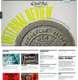
The Bold Italic: Covering local stories, venues and events with style

The Bold Italic is not about typography. It’s not a news site either, but it feels like one – albeit a very trendy news site. In fact, it’s about ‘local discovery’ – trendy San Francisco types write about their local obsessions. Venues, merchants and events are also covered. From the about page:

Just when you thought you were a pretty savvy local, along came The Bold Italic. Our mission is to help people become better locals, equipping our members with rare local intel, backstory and potential adventures.

Our writers, the Bold Locals, find their way behind-the-scenes in San Francisco and come back with backstories of distinctive, offbeat local experiences.

A San Franciscan, such as yourself, can keep pieces of these backstories — a particular merchant, landmark, or product — in the Clipbook. That’s the tab on the left with shapes on it.

It’s a hugely appealing site. Anyone considering a local web project should study it closely.

Britons remain tolerant despite terror outrages

Okay, so I know the Metro isn’t exactly the bastion of great journalism or anything, but they ran a story today based on a Harris Interactive study, that bugged me: METRO: Britons remain tolerant despite terror outrages (the linked story lacks the infographics that accompanied the printed article).

Harris Interactive interviewed 1,296 people, who were asked to rank their strength of faith from 0-10, with zero being agnostic. I’m curious why the Metro used this label. Surely atheist is the correct definition for someone with 'zero faith'? To me, agnosticism implies that some doubt – trace amounts of faith – may remain.

The main issue the data raised for me was completely ignored by the article. Those surveyed were asked which religion was 'best' and which was 'worst'. Sensibly, 65% answered that no one religion was better or worse. Christianity stormed ahead in popular opinion however, with 26% voting it the 'best'. The 'worst', according to 24%, was Islam.

That result, in my view, contradicts the Metro's conclusion that we remain tolerant. Also, there is a very strong implication that it's the Christians that have the biggest problem with Islam. Sadly, the Harris Interactive data hasn’t been published on their site to elaborate on the Metro's assertions.

I left a (polite and reasonable) comment on the Metro post, but it wasn’t published.