I didn’t notice when it got approved, but I just spotted that my book icon is now available on The Noun Project.
![]()
It’s CC0 licensed, and comes with and without a bookmark.
I didn’t notice when it got approved, but I just spotted that my book icon is now available on The Noun Project.
![]()
It’s CC0 licensed, and comes with and without a bookmark.

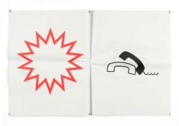
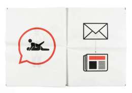
London-based graphic designer Stephen McCarthy reimagined what newspapers would look like if they were purely in pictographic forms.
In his project ‘Pictograms: The Newspaper’, McCarthy reinterpreted a whole newspaper (namely, ‘The Sun’) in pictographic content.
Designer Reimagines News As Pictograms, So Don’t ‘Read’ All About It – designtaxi.com
![]()
These privacy icons by Aza Raskin for Mozilla’s privacy icon project are interesting. Hopefully we will end up with some clear icons in Firefox to make us aware of what is happening with all our data. I doubt they will be this complicated though. I do really like these earlier Creative Commons style Data Privacy Declaration icons however. (via netzpolitik.org)

Today’s daily design is an icon of an old cassette tape. I’m making the actual SVG vector file available with this post in an attached ZIP file (I think Posterous does something sensible with those!)*. I consider it free to use for any non-profit reason.
It generally follows the principles of the Tango icons, commonly used on Linux’s Gnome desktop, but I haven’t exactly paid close attention to their guidelines.

* Note 2011.10.13: This post was written at a time when this blog was hosted on Posterous, who offered hosting for small data files like this. Leave a comment if you want a copy of this icon, and I’ll Dropbox it for you.
![]()
I’ve been slightly tweaking a nice WordPress theme to use for my blog, and I wanted to use some nice minimalistic icons. I had in mind the excellent Picol project icons, but on closer inspection they were a bit mismatched and when I saw them in place they looked like they had come from several different icon sets.
So these were heavily inspired by Picol, but a little more rounded and consistent with each other. The set took less than an hour.On and off for the last week I have been experimenting for pretty much the first time with some icon designs for an Openbox logout script being written by Nik_Doof for #! CrunchBang Linux.
I’ve attached a screenshot below of the 0.1 release in action, as well as some alternative icons. I plan to revamp the icons: I’m going to try a set making better use of PNG transparency, and also provide a smaller size (64×64?). Of course, I’ll also make the SVGs available in due course.
Any feedback is welcome!


Army of Trolls: Lovely pixel art at home in well conceived site. Especially nice are the PC + MAC icons.
