Obscure and invented punctuation marks

Andorpersand

An andorpersand

There’s something fascinating to me about obscure punctuation marks. I think it’s that I have great sympathy for smart people who attempt to solve problems that regular people don’t really care about.

Flavorwire recently posted a roundup of interesting real punctuation marks (an article that seems to have been cribbed from an older mental_floss post actually). Most of these are the creations of Hervé Bazin who proposed new exclamation and question mark variations to signify acclamation, certainty, doubt, love and others.

Hervé Bazin's punctuation marks

Hervé Bazin’s proposed punctuation marks for acclamation, certainty, doubt and love

On the lighter side, College Humor has recently invented eight new punctuation marks (that it thinks) we desperately need.

Mockwotation marks

Mockwotation marks

The mockwotation marks are my absolute favourites. I would do away with the actual quotation mark elements and just keep the wavy hands.

Similarly, I wonder if there could be a fun use for an air quotes / scare quotes punctuation mark? I would use them to distance myself from some awful turn of phrase by indicating that it’s not something I would usually say.

Air quote punctuation marks

More punctuation fun →

Advertisement

Courier Prime: A free font for screenplays

Courier Prime is a free and open source monospaced typeface by Alan Dague-Greene. It’s an improved Courier, designed to be ‘less blobby’ with a bolder bold and real italics.

Courier Prime

Since the beginning, screenplays have been written in Courier. Its uniformity allows filmmakers to make handy comparisons and estimates, such as 1 page = 1 minute of screen time.

But there’s no reason Courier has to look terrible. We set out to make the best damn Courier ever.

Continue reading

Link

Playfic is a community for writing, sharing, and playing interactive fiction games (aka “text adventures”).

Playfic

Behind the scenes, Playfic simply takes the game source you enter and passes it to the commandline Inform 7 compiler, and views it in the browser using the open-source Parchment interpreter that plays the games. Playfic’s just the social glue tying them together.

This seems like a great way to get started with IF!

Continue reading

Bathroom products for guys: an icon system

Imperial Leather SkinKind hydrate cotton extract & oat milk BODY WASH hypoallergenic

Imperial Leather SkinKind hydrate cotton extract & oat milk BODY WASH hypoallergenic

As a non-single guy who has relinquished control over the buying of bathroom products, I am regularly confused when confronted with a new selection of unfamiliar bottles. For example, I was just faced with Imperial Leather’s “SkinKind hydrate cotton extract & oat milk BODY WASH hypoallergenic”. At least here the keywords are capitalised, but I’m pretty sure it’s often the case that marketing jargon entirely replaces the keywords (Shampoo, conditioner and body wash or shower gel) that I’m seeking.

Perhaps the soap companies could spare a little space on the lids for a simple icon that quickly explains the intended use to the uninterested user.

In these quick examples below, the first icon is a shampoo and conditioner, while the second is a body wash.

Please and thank you.

Excerpting policy

From the Business Insider excerpting policy:

We excerpt others the way we hope others will excerpt us.

What does that mean? It means that if you think our stuff is worth bringing to your readers’ attention, we are honored and grateful. Please excerpt it as liberally as you want. In return, please just give us clear credit, links back, and an incentive for interested readers to visit our site. (Not all readers–some.)

This is an issue I agonise over a fair bit, and it’s interesting to learn that BI are actually somewhat more permissive in this area than I would expect them to be.

Continue reading

PragProWriMo

Like NaNoWriMo, but for technical book authors: PragProWriMo – the Pragmatic Programmers Writing Month.

To help you along, we’re setting up a forum and a Twitter account. Follow us on Twitter at @pragprowrimo to stay up to date. Join the forum at forums.pragprog.com/forums/190 for more detailed writing advice, answers to your writing questions, and progress reports from participants. And when you finish your 60 pages, you might even get some special recognition from us.

(via pragprog.com)

Continue reading

Using A/B testing to find story ideas

I’ve been reading In The Plex, recently, so naturally I’ve been thinking a lot about how to use data in interesting ways. This post appealed:

Earlier I read this post via Hacker News on testing startup ideas. It got me thinking about whether or not you could do something similar in your newsroom. I’ll call it A/B Testing for News Coverage.

via Using A/B testing to find story ideas – andymboyle.com

In a nutshell: Write some spec articles, run AdWord campaigns for them, see which ones are most popular. You could get the value of this without running any ad campaigns though. All webmasters – especially those with newsy content – should pay attention to their analytics to learn what content has proved popular, what searches brought readers in, and be on the look out for spikes of interest in particular topics.

When I clicked through to read this blog post, I was expecting it to be a post about A/B testing fiction story ideas. Imagine a kind of choose your own adventure story where the author writes the opening of the story, then two or three different continuations. The most popular branch becomes canonical, and the author continues the story from there.

I doubt that’s an idea that’d appeal to many authors, but some variation of this could be a fun experiment.

No, you do not have ‘a Tumblr’

The 2012 Obama campaign is now on Tumblr, and I have a big problem with them:

HI, TUMBLR.

It’s nice to meet you.

There are lots of reasons we’re excited to be launching the Obama 2012 campaign’s new Tumblr today. But mostly it’s because we’re looking at this as an opportunity to create something that’s not just ours, but yours, too.

We’d like this Tumblr to be a huge collaborative storytelling effort—a place for people across the country to share what’s going on in our respective corners of it and how we’re getting involved in this campaign to keep making it better.

My problem is not political, it’s a grammar niggle.

The Obama campaign does not have ‘a Tumblr’. Tumblr is the company and the blogging platform they run. Tumblr is the sum total of all the Tumblr blogs. They have a tumblelog, or a Tumblr blog, or just a blog.

Likewise one doesn’t have ‘a Twitter’. You use Twitter, you are on Twitter, you have a Twitter page or a Twitter feed or a Twitter profile, but Twitter is the company and the service.

See also: The correct use of ‘blog’ and ‘blog post’, wherein I correct Mr. Stephen Fry.

Point d’ironie⸮

I can’t see obscure punctuation like the ‘snark’ finding a place any time soon. People seem to have enough problems with the punctuation we already have. Besides, sarcasm symbol would instantly reduce the humour in the sarcasm – it’s a bit like explaining a joke.

Another mark, now obscure, is the point d’ironie, sometimes known as a “snark.” A back-to-front question mark, it was deployed by the 16th-century printer Henry Denham to signal rhetorical questions, and in 1899 the French poet Alcanter de Brahm suggested reviving it. More recently, the difficulty of detecting irony and sarcasm in electronic communication has prompted fresh calls for a revival of the point d’ironie. But the chances are slim that it will make a comeback.

Is This the Future of Punctuation!? – online.wsj.com

Continue reading

National Novel Writing Month

Every year I toy with the idea of participating in NaNoWriMo. I don’t consider myself a good writer, but I have lots of ideas for stories and characters. I think I would enjoy the cathartic aspect of just trying to churn out a novel NaNoWriMo style:

National Novel Writing Month is a fun, seat-of-your-pants approach to novel writing. Participants begin writing on November 1. The goal is to write a 50,000 word, (approximately 175 page) novel by 11:59:59, November 30.

Valuing enthusiasm and perseverance over painstaking craft, NaNoWriMo is a novel-writing program for everyone who has thought fleetingly about writing a novel but has been scared away by the time and effort involved.

Because of the limited writing window, the ONLY thing that matters in NaNoWriMo is output. It’s all about quantity, not quality. This approach forces you to lower your expectations, take risks, and write on the fly.

Maybe. Maybe.

A Dribbble for writing

Dribbble is a community site for very talented graphic designers. It’s not their role to debate these details. I would love to see a Dribbble for writing. A place where I can post the latest Intercom broadcast, email, even a sentence from the interface and get feedback. “You can strip the word currently there.“, “The important word here is buried in the middle of the sentence!“. “The message makes sense, but what I am supposed to do next?“.

(via The Language of Interfaces – contrast.ie)

A clever idea. I could see this being useful outside of UX circles. Perhaps for crafting the perfect marketing tweet or optimising a paragraph for SEO? I could even see some ways to make this profitable…

The correct use of ‘blog’ and ‘blog post’

I’m sure for some this is a point of pure pedantry, but it bugs me nonetheless. Let me clarify:

  • A blog is a particular type of website that contains many blog posts.
  • The verb use ‘I am up updating my blog’ is appropriate, but not ‘I am writing a blog’. (Technically, I appreciate you are writing a blog, but it is more likely you mean to say ‘I am writing a blog post’ or ‘I am blogging’.)
  • A single entry on a blog, like this one, is a blog post (or simply a post, if you prefer).

You are very welcome.

If you type two spaces after a full stop, you’re doing it wrong. Period.

Every modern typographer agrees on the one-space rule. It’s one of the canonical rules of the profession, in the same way that waiters know that the salad fork goes to the left of the dinner fork and fashion designers know to put men’s shirt buttons on the right and women’s on the left. Every major style guide—including the Modern Language Association Style Manual and the Chicago Manual of Style—prescribes a single space after a period. (The Publications Manual of the American Psychological Association, used widely in the social sciences, allows for two spaces in draft manuscripts but recommends one space in published work.) Most ordinary people would know the one-space rule, too, if it weren’t for a quirk of history. In the middle of the last century, a now-outmoded technology—the manual typewriter—invaded the American workplace. To accommodate that machine’s shortcomings, everyone began to type wrong. And even though we no longer use typewriters, we all still type like we do. (Also see the persistence of the dreaded Caps Lock key.)

The problem with typewriters was that they used monospaced type—that is, every character occupied an equal amount of horizontal space. This bucked a long tradition of proportional typesetting, in which skinny characters (like I or 1) were given less space than fat ones (like W or M). Monospaced type gives you text that looks “loose” and uneven; there’s a lot of white space between characters and words, so it’s more difficult to spot the spaces between sentences immediately. Hence the adoption of the two-space rule—on a typewriter, an extra space after a sentence makes text easier to read. Here’s the thing, though: Monospaced fonts went out in the 1970s. First electric typewriters and then computers began to offer people ways to create text using proportional fonts. Today nearly every font on your PC is proportional. (Courier is the one major exception.) Because we’ve all switched to modern fonts, adding two spaces after a period no longer enhances readability, typographers say. It diminishes it.

(via Space Invaders – Why you should never, ever use two spaces after a period – slate.com)

Amen.

Tweaking Twain

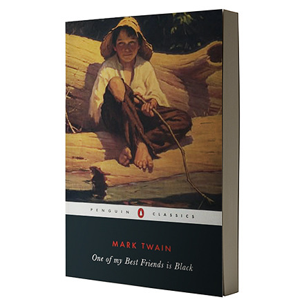
A new edition of the Adventures of Huckleberry Finn, scheduled to be published in February by NewSouth Books, substitutes the word “slave” for the “n-word” and “Indian” for “injun” throughout the book.

The publisher has been accused of censorship and altering a classic of American literature for the sake of political correctness. Early argues that this is just another case of tinkering with texts in order to create a version that best serves its audience.

Continue reading

Google’s reading age tool

Google have recently added the option to filter your search results by reading level. This could be a great feature for teachers. The virtualeconomics blog has turned this tool onto UK newspaper websites, with some interesting results:

No big surprises that the Sun, Mirror and News of the World sit together at the bottom of the list, or that they’re joined there by the commuter freebie Metro; nor that the FT contains almost no “basic” language pages and the most “advanced”. But the middle of the table is more interesting, with the Guardian scoring much the same reading age as the Daily Mail, and the Independent sitting at the top of the qualities isn’t necessarily what I’d have guessed.

via Google’s reading age tool – comparing UK newspapers – virtualeconomics.co.uk

Continue reading

But-heads and their phrases that announce ‘I’m lying’

I hate to be the one to tell you this, but there’s a whole range of phrases that aren’t doing the jobs you think they’re doing.

In fact, “I hate to be the one to tell you this” (like its cousin, “I hate to say it”) is one of them. Think back: How many times have you seen barely suppressed glee in someone who — ostensibly — couldn’t be more reluctant to be the bearer of bad news? A lack of respect from someone who starts off “With all due respect”? A stunning dearth of comprehension from someone who prefaces their cluelessness with “I hear what you’re saying”? And has “I’m not a racist, but…” ever introduced an unbiased statement?

These contrary-to-fact phrases have been dubbed (by the Twitter user GrammarHulk and others) “but-heads,” because they’re at the head of the sentence, and usually followed by but. They’ve also been dubbed “false fronts,” “wishwashers,” and, less cutely, “lying qualifiers.”

via I hate to tell you – boston.com

I like ‘lying qualifiers’ best.

(via)

Interesting column about which NY Times stories are the most shared

More emotional stories were more likely to be e-mailed, the researchers found, and positive articles were shared more than negative ones. Longer articles generally did better than shorter articles, although Dr. Berger said that might just be because the longer articles were about more engaging topics.

[…]

Building on prior research, the Penn researchers defined the quality as an “emotion of self-transcendence, a feeling of admiration and elevation in the face of something greater than the self.”

They used two criteria for an awe-inspiring story: Its scale is large, and it requires “mental accommodation” by forcing the reader to view the world in a different way.

“It involves the opening and broadening of the mind,” write Dr. Berger and Dr. Milkman, who is a behavioral economist at Wharton.

(via nytimes.com)

It sounds like a really interesting study. I’ve had a notion for some years now to start a blog on ‘futurology’ or something similar. Now I’m wondering if that could be a hit…

Is there any good reason to use title case?

The convention followed by many British publishers (including scientific publishers, like Nature, magazines, like The Economist and New Scientist, and newspapers, like The Guardian and The Times) is the same used in other languages (e.g., French), namely to use sentence-style capitalization in titles and headlines, where capitalization follows the same rules that apply for sentences. This convention is sometimes called sentence case where a term is desired to clarify that title case shall not be applied. It is also widely used in the United States, especially in bibliographic references and library catalogues. Examples of global publishers whose English-language house styles prescribe sentence-case titles and headings include the International Organization for Standardization.

(via en.wikipedia.org)

I’ve developed the habit of using sentence case for headlines, but now I’m facing a situation where I’m probably going to have to adapt to a new style guide and start using Title Case at work. I’ve developed a strong preference for sentence case, and now find title case to be ugly and tabloid-esque.

It seems likely to me that title case is a hangover from the days of more primitive typesetting, when you would need to distinguish between BIG HEADLINES, Important Headlines, and regular text.

In these days of HTML and CSS, is there really any good reason to use title case?