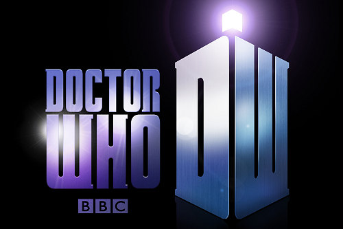
This evening I’ve been playing around in Inkskape, trying to reproduce the typeface used in the new Doctor Who logo. If I finish it, I’ll set it free on the internet for the Whovians to play with. I picked it mostly because it’s a nice simple design. I plan to call the font ‘Geronimo’.
On closer inspection, I’ve started to take a strong dislike to this new logo. I find the ‘DW’ TARDIS shape to be huge and ugly, but even the letters themselves seem to have some funny issues. Look at the third slide attached to this post, or go and find a larger version of this image on the BBC site. The H‘s right leg is thicker, and the O is not symmetrical vertically! The W is just so ugly I’m reluctant to draw it, and I have no idea why they made the R like they did.
Anyway, I’m going to be faithful to what they’ve done here, but I’ll probably build in an alternate character set with my own ‘improvements’.


That BBC “DW” is a bit weird isn’t it. Each corner radius (on the “O” for example) seems to be chosen at random.
@dorkomatic Yeah, I spotted that. I think it was just designed in a hurry. These things usually are. I’m not going to be 100% faithful to the original, because I just can’t bring myself to reproduce stuff like that!