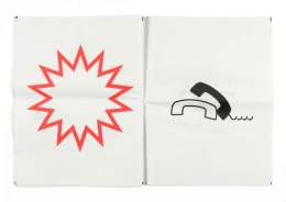
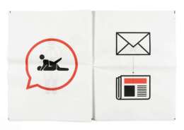
London-based graphic designer Stephen McCarthy reimagined what newspapers would look like if they were purely in pictographic forms.
In his project ‘Pictograms: The Newspaper’, McCarthy reinterpreted a whole newspaper (namely, ‘The Sun’) in pictographic content.
Designer Reimagines News As Pictograms, So Don’t ‘Read’ All About It – designtaxi.com
Tag Archives: Open Paper
Open Paper
Status
I’m gradually migrating over the content from my Open Paper Tumblr blog. It was originally started because I had an idea to crowdsource content and design for a Newspaper Club project. While I was trying to decide what the paper should be about, I collected interesting, inspirational and useful links on the blog. These will be preserved here under the tag Open Paper, alongside regular halfblog.net posts.
I’d still like to produce a paper, but I probably won’t crowdsource the content.
Free Museum San Francisco
This guide called The Free Museum San Francisco is a public art tour of the city designed and curated for Arkitip Intel’s Newspaper Supplement. The only caveat being that it requires a bit more will-power (or, ideally, a bike) to view. Each artist is distinguished by a unique pattern and demarcated in the legend of the map.
Side note: this was the first printing of Mike Abbink’s Milo Serif typeface, which holds its own on the page, even when competing with an eclectic mix of patterns. Kyle is hard at work on the annotated espresso version of the tour.
(via Free Museum San Francisco – everything-type-company.com)
Continue reading
Flawed typefaces

Optimo Didot the Elder compared to Linotype Didot.
What constitutes a flawed typeface? For this article it is defined as a typeface that is perfectly fine—except for one nagging aspect, usually a single character. A flawed typeface is one that either you avoid using entirely because of this lone defect; or one that you use sparingly—and only then, after some alteration of either your design or the face itself to ameliorate the “flaw”. Flawed typefaces are not bad or even mediocre. The whole premise here is that they are good, perhaps even classic or wildly popular. And yet there is a single character that ruins them or, at the very least, causes one to pause before specing them.
Eureka magazine
The second issue of Eureka — a new science supplement to The Times — is out and it’s looking like a design classic in the making. Matt Curtis (art direction), Matt Swift (information graphics), and David Loewe (design) comprise the design team for the new publication. Going to have to track down a copy for myself.
Browse the full issue here