
 Most infographics on the web consist of generic graphics backed up with (lots of) poorly researched text.
When done well these informational graphics use charts, diagrams and illustrations to make complex ideas easier to comprehend. At their best the results can be quite illuminating.
Randall Munroe has produced more than a few great infographics for xkcd. His infographics can be broken down into three rough categories:
- Pure gag charts,
- Jokey graphics with a serious point, and…
- Well-researched highly informative graphics with some jokes sprinkled throughout.
For this post I’ve compiled the more informative types. There’s a list of some (but not all) of xkcd’s novelty graphs and charts at the end of this post.
Map of the Internet 195 (2006-12-08)
This first xkcd diagram maps out the IPv4 address space of 2006, with no jokey notes whatsoever.

The Electromagnetic Spectrum 273 (2007-06-06)
The second fully-fledged xkcd diagram is a much more amusing look at the electromagnetic spectrum, real and imagined. This is one of my favourites.

Height and Depth 482/485 (2008-09-29/2008-10-06)
Accurate on a log-scale, these diagrams depict items from a human scale to the limits of our perceptions. The results are reminiscent of the famous Charles and Ray Eames film Powers of Ten.


- Buy the poster for Height (but not Depth).
- See also: Powers of One
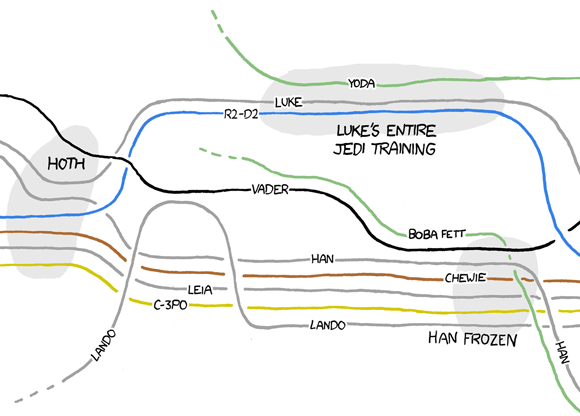
Movie Narrative charts 657 (2009-11-02)
The interactions of characters in The Lord of the Rings films, the original Star Wars trilogy and others.

Here’s a detail from the beginning of The Empire Strikes Back:
Gravity wells 681 (2009-12-28)
To enter space from Earth you have to ‘climb’ its gravity well. The more massive the planet (or star) the deeper the gravity well. Other solar bodies (like small moons and asteroids) have wells so shallow you could literally leap from them into space.

A detail:

Self-description 688 (2010-01-13)
A recursive, self-descriptive comic.

Google results for various phrases 715 (2010-03-17)

- See also: Trochee Chart, a blog post with more information about these diagrams.
- Reminds me of: Google search results for “KH(Ax)N” for x=1 to 100
Color survey results (2010-05-03)
Based on a survey of 222,500 users who named over 5 million colours, this graphic was published on the xkcd blog (or ‘blag’), along with some other interesting diagrams.

- Reminds me of: This graphic that classifies the meanings we see behind certain colours.
University website 773 (2010-07-30)
A Venn-diagram illustrating the vast gulf between what people who design university websites think is wonderful about their university, and what people who visit their websites are actually looking for.

- See also: .eduGuru has a go at redesigning a college website based on these observations (and inspired by Craigslist’s stripped-back aesthetic).
Map of Online Communities 802 (2010-10-06)
This fun map uses size to represent total social activity within a community (talking, playing, sharing etc.), loosely arranged by type and historical connections.

This is just a detail. View the full version on xkcd.
- See also: The previous 2007 Map of Online Communities
- Buy the poster
Complete map of optimal Tic-Tac-Toe moves 832 (2010-12-10)
Or Noughts and Crosses to UK readers. I’m just including the half that shows all the moves for ‘O’ here:

- Reminds me of: This amusing RadioLab episode
Radiation dose chart (2011-03-19)
This chart appeared on the xkcd blog (and was later updated) to provide context in the days when the Fukushima disaster was unfolding.

(I wonder if this chart provided the inspiration for the similar and famous money chart that came later in the year?)
Days of the week 930 (2011-07-27)
Polar graph of what stuff happens on which days, based on number of Google results for phrases like “Company meeting on <day>”

- Reminds me of: These brilliant personalised calendar charts (See also: My blog post about the Radical Cartography site.
Money chart 980 (2011-11-21)
This is almost certainly the most important and profound infographic Randall has produced for xkcd.
It’s impossible to comprehend the huge numbers that are casually reported in the news every day. Like a child for whom everyone over 20 is ‘really old’, we have trouble understanding the differences between millions, billions and trillions. This impressive megachart helps to bring some perspective.

There’s a huge zoomable version of this chart for you to explore. Every little section is a noteworthy infographic in its own right, from the dollars…

…to the billions of dollars…

…and the trillions of dollars.

The 20 most played Christmas songs 988 (2011-12-09)
Every year, American culture embarks on a massive project to carefully recreate the Christmases of Baby Boomers’ childhoods.

Lakes and oceans 1040 (2012-04-09)
A to-scale comparison of the depths of great lakes and oceans.

Exoplanets 1071 (2012-06-20)
All 786 known planets (as of June 2012) to scale.

New extrasolar planets are being discovered all the time. The current count as of this blog post (January 2013) is 859.
(I’m saddened that this is comic 1071, not 1701.)
The United Shapes 1079 (2012-07-09)
What the shape of each of the US states reminds Randall Munroe of.

Your central visual field 1080 (2012-07-11)
Vision related facts, arranged so that they all fit inside your field of vision.

A History of The United States Congress 1127 (2012-10-29)
A look at the ebb and flow of the partisan and ideological makeup of the US Congress.

I’ll be honest: I haven’t studied this one sufficiently to confidently claim that I properly understand it. Try the Explain xkcd wiki for guidance.
Up Goer Five 1133 (2012-11-12)
A diagram of a Saturn V rocket, labelled using only the 1,000 most commonly used words in the English language.

This diagram inspired the creation of an Up-Goer Five text editor and the #upgoerfive trend on Twitter. I wrote about this recently on this blog.
- View the full diagram on xkcd
- See also: The Up-Goer Five Text Editor (and how to use it for SEO)
- Reminds me of: Idiocracy
Calendar of Meaningful Dates 1140 (2012-11-28)
Each date’s size represents how often it is referred to by name in English-language books since 2000, according to the Google Ngram Viewer.

Unsurprisingly September 11th looms large, but interestingly the 11th on every other month is a particularly uneventful date. Perhaps we subconsciously avoid it because of the strong negative association.
Other noteworthy xkcd graphics
More charts and diagrams I didn’t want to omit, but which are more subjective and gag-oriented. By date:
- Flowchart for creating an AIM profile
- The Blogofractal
- Profanity usage by cause
- Fuck grapefruit: Tastiness vs. difficulty to eat, charted.

- Dangers, indexed by the number of Google results for “Died in a ____ accident”
- A guide to understanding flow charts, presented in flow chart form.
- Guide to converting to metric
- The ‘base’ metaphor explained
- Tech support cheat sheet
- Circuit diagram
- Frequency with which various adjectives are intensified with obscenities (Based on Google hits)
- How to write good code: A flowchart.
- Learning to cook, a flowchart.
- The future according to Google search results
- Number of living humans who have walked on another world
- Password strength (See also this xkcd password generator and an analysis of the technique by a security consultant.)
- What your favorite map projection says about you
- Ablogalypse
- Well-known felines: The OS X problem.

- College laundry habits
- Sports cheat sheet
- Log scale: Fuel energy density, a chart.
Links of interest
- xkcd’s what if? blog has lots of great diagrams too. Notably: Death rates, Raindrop and Cassini.
- Explain xkcd: A wiki.
- Catalog of exoplanets
- Plotting xkcd-style graphs in Mathematica
Elsewhere on this blog
- The Up-Goer Five Text Editor (and how to use it for SEO)
- Ablogalypse
- Dreams
- Fun with the Google Ngram Viewer and More ngrams
Copyright note
Randall Munroe releases all of his xkcd images under a Creative Commons licence (CC-BY-NC to be exact) and I’m using them here in that spirit.

Pingback: === popurls.com === popular today
Pingback: OTR Links 01/24/2013 « doug – off the record
Pingback: Florence Nightingale; the mother of Infographics? (btw she was also a nurse……) | What's the PONT
Pingback: 2nd Annual Ecopress Contest: NREL & ESS Graduate Student Infographics | EcoPress