How not to treat your customers online: Google bring sucky web experiences to life

I really appreciate these hilarious videos made by Google Analytics. They’re a perfect illustration of how frustrating shopping online can be.

Online Checkout

With the holiday shopping season in full swing, it’s important to ensure your website and digital marketing is running on all cylinders. Your potential customers should be able to find what they need on the digital shelf as easily as in real life. Sadly, many sites leave visitors frustrated – losing potential customers. However, the advantage of your online storefront is that you can understand where you’re losing customers and work to improve your shopping experience.

Google Analytics in Real Life: What would your customer experience look like? – analytics.blogspot.ca

Watch the other two videos from this Google campaign →

Advertisement

A Dribbble for writing

Dribbble is a community site for very talented graphic designers. It’s not their role to debate these details. I would love to see a Dribbble for writing. A place where I can post the latest Intercom broadcast, email, even a sentence from the interface and get feedback. “You can strip the word currently there.“, “The important word here is buried in the middle of the sentence!“. “The message makes sense, but what I am supposed to do next?“.

(via The Language of Interfaces – contrast.ie)

A clever idea. I could see this being useful outside of UX circles. Perhaps for crafting the perfect marketing tweet or optimising a paragraph for SEO? I could even see some ways to make this profitable…

I don’t care about SEO

A few months ago I tweeted that we no longer needed to sell User Experience and our job was now to focus on delivering good user experiences.

These days we’ve stopped selling UX and started simply doing it.

Sure, some agencies or individuals haven’t quite reached that inflexion point yet, but I can tell you that it’s on the way. Demand is far outstripping supply, so if you’re not there yet, you soon will be. User Experience is no longer a point of difference, it’s just the way all good websites are built these days.

I don’t care about User Experience – andybudd.com

Hopefully in the very near future this shift in approach will happen for SEO too. There really shouldn’t be an SEO company or a marketplace of SEO ‘experts’. The work of SEO is half website design and development (good semantic markup, sensible layouts) and half content production (incorporating keywords, writing good titles and meta descriptions etc.). These skills should be in-house and standard practice.

Breadcrumb navigation in the URL bar

Breadcrumb navigation in the URL bar

I propose that the URL bar be modified to fulfill a significant purpose for the user other than just displaying long strings of characters mostly irrelevant to, and mostly ignored by, the user. A user should be aware of his location on the Internet at all times, and of any relevant information that he has requested or transmitted in getting there. The way the URL bar presents that information is completely inadequate.

via Making the URL Bar Useful Again: Where the breadcrumb should have been all along – uxmag.com

Some smart thinking here, and some excellent opposing views in the comments. I can see something very similar to this really working. It would need to be something the browser could figure out itself though, based on the logical arrangement of the site itself, and not by using the extra markup proposed here.

I can see how you could use this space for some neat shortcuts – like logging in through a drop down, or searching within specific sections of a site. Also, when you get a 404, the URL bar could present some navigation options to get you back on track, maybe even by displaying a drop down list of pages you may have been looking for.

Insightful landing page case study

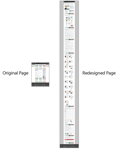
In our analysis of Rand’s effective face-to-face presentation we noticed that he needed at least five minutes to make the case for SEOmoz PRO. Yet the existing web page was more like a one-minute summary. Once we added the key elements of Rand’s presentation, the page became much longer:

Short versus long body copy case study

It’s interesting to note that Amazon.com, which is known for its relentless testing, tends to have extremely long product pages. Just see the page for its Kindle reader.

via conversion-rate-experts.com

There’s a lot of useful information in this article, but this page length comparison and the technique of writing copy with ‘curiosity rather than overt “buy me” language’ were the big takeaways for me.

Posted in SEO | Tagged

#0044CC – The one hundred million dollar colour

Microsoft also tested multiple versions of blue for links in their search results. A specific color of blue (#0044CC) drove $80-$100 million dollars a year increase over the light blue the design team tried first.

(via lukew.com & found via Andrew Parker)

Andrew references Douglas Bowman in his post, who quit Google’s design team, citing an example of the time the company did extensive testing to pick from 41 shades of blue. It seems that perhaps Google have it right.