Does Internet advertising work at all?

The Atlantic’s Derek Thompson asks a dangerous question: Does Internet advertising work at all? My gut answer is that it can’t be terribly effective. Thompson sums up my personal instinct about advertising perfectly: “We seek information, so we’re more likely to trust it; marketing seeks us, so we’re more likely to distrust it.”1

Also, online advertising is plagued with problems like misleading stats reporting and the ‘I-was-gonna-buy-it-anyway bias’:

Let’s say I want to buy a pair of glasses. I live in New York, where people like Warby Parker. I’ve shopped for glasses at Warby Parker’s website. Facebook knows both of these things. So no surprise that today I saw a Warby Parker sponsored post on my News Feed.

Now, let’s say I buy glasses from Warby Parker tomorrow. What can we logically conclude? That Facebook successfully converted a sale? Or that the many factors Facebook considered before showing me that ad—e.g.: what my friends like and my past shopping behavior—are the same factors that might persuade anybody to buy a pair of glasses long before they signed into Facebook?

Maybe Facebook has mastered the art of using advertising to convert sales. Or maybe it’s mastered the art of finding people who were going to buy certain items anyway and showing them ads after they already made their decision. My bet is that the answer is (a) somewhere in the middle and (b) devilishly hard to accurately measure.

Nothing in this article was surprising, but it did make me wonder if this might be the most effective way to fight to get our online privacy back? In other words, rather than fighting Google or Facebook et al, why not reveal how ineffective the kind of crappy advertising that has made those companies some of the biggest in the world really is? If that money falls away, so will these corporate surveillance industries.


Dat footnote

  1. However, I do think that ‘brand awareness’ is a powerful side effect of good advertising, but this is hard to achieve with text ads or even flashing banners and annoying popovers.

Google has a terrible 404 page

Google's 404 robot On the face of it Google has a perfectly decent 404 page. There’s a cute little robot illustration and an amusing page title (‘Error 404 (Not Found)!!1’). Also on the positive side, the page is very light, using only 11 lines of code and two small images.

However, there is absolutely no functionality beyond the Google logo being a link back to the home page. What I think Google should do instead →

The infographics of xkcd

Log scale Most infographics on the web consist of generic graphics backed up with (lots of) poorly researched text.

When done well these informational graphics use charts, diagrams and illustrations to make complex ideas easier to comprehend. At their best the results can be quite illuminating.

Randall Munroe has produced more than a few great infographics for xkcd. His infographics can be broken down into three rough categories:

  1. Pure gag charts,
  2. Jokey graphics with a serious point, and…
  3. Well-researched highly informative graphics with some jokes sprinkled throughout.

For this post I’ve compiled the more informative types. There’s a list of some (but not all) of xkcd’s novelty graphs and charts at the end of this post.

For science! →

How not to treat your customers online: Google bring sucky web experiences to life

I really appreciate these hilarious videos made by Google Analytics. They’re a perfect illustration of how frustrating shopping online can be.

Online Checkout

With the holiday shopping season in full swing, it’s important to ensure your website and digital marketing is running on all cylinders. Your potential customers should be able to find what they need on the digital shelf as easily as in real life. Sadly, many sites leave visitors frustrated – losing potential customers. However, the advantage of your online storefront is that you can understand where you’re losing customers and work to improve your shopping experience.

Google Analytics in Real Life: What would your customer experience look like? – analytics.blogspot.ca

Watch the other two videos from this Google campaign →

The best Google Webmaster videos

Dear Matt Cutts I thought it might be useful to bring together ten of the most popular videos from Google’s Webmasters YouTube channel.

I’ve taken the liberty of filtering out the marketing videos and have just focused on the freely given SEO advice. Most of these feature Matt Cutts answering user-submitted questions or Maile Ohye giving general advice. These are pretty jargon-free and are clearly intended for webmasters without much working knowledge of SEO.

Learn what Google has to tell us about SEO →

Pizza / not pizza

Here is the Google search results page for ‘pizza’, circa 2012:

Google results for 'Pizza' — 2012

Clearly what you want to see and what Google wants you to see are now two different things. It wasn’t always like this. (And in fairness, it isn’t always as bad as this example.) Continue reading

Google Chrome 15 adds gesture animations for OS X Lion

I just uploaded this short video comparing the new gesture animations in Google Chrome with those in Safari.

In this video, I navigate through three pages, then use gestures (finger swipes on my Magic Mouse) to show how the animations look. Safari makes the navigation direction (forwards or backwards) clear, while Chrome adds confusion to what should be a really intuitive gesture.

Chrome has also added the little page-bounce animations you see in other native Mac apps when using a touch device, and even used the same linen texture for the empty space.

Site traffic: Posterous vs. WordPress.com

Aside

Curiously, I seem to be getting much more traffic now I’m hosting this blog on WordPress.com. I used to get 100-200 visits per day on Posterous, but now I’m seeing 200-300.

It could be a simple reporting difference, but I know from personal experience that Posterous could be slow to the point where the page never finished loading. I wonder if it regularly prevented the Google Analytics script at the end of the page from getting loaded?

Continue reading

The evolution of the web

Here’s another infographic that looks pretty, but fails at conveying information in any useful way: The Evolution of the Web.

[…] To pay homage to the goodness of the web, we’ve put together an interactive infographic, built in HTML5, which details the evolution of major web technologies and browsers:

via Happy third birthday, Chrome! – googleblog.blogspot.com

I understand the timeline aspect, showing major revisions, but what are the coloured lines illustrating? According to the page:

The color bands in this visualization represent the interaction between web technologies and browsers, which brings to life the many powerful web apps that we use daily.

Which sounds a bit hand-wavy to me. Lets look at the interaction of JavaScript with web browsers in more detail, for example:

Continue reading

The 20 most expensive keywords (and another misleading infographic)

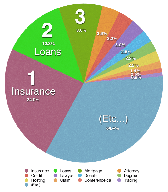
This infographic shows that just over half of the top AdWord keywords fall into insurance and loans categories … but hang on … 24% and 12.8% add up to 36.8%, not 50% or more. I’ve knocked up a quick chart in Numbers showing what I think the pie should look like in reality. Am I missing something? Why would somebody even want to misrepresent that data? So they can overcharge finance companies for SEO work?

Still, the data itself is quite interesting (if you still trust it):

The 20 keyword categories with the highest search volume and highest costs per click, thereby netting Google the most money, are:

  1. Insurance (example keywords in this category include “buy car insurance online” and “auto insurance price quotes”)
  2. Loans (example keywords include “consolidate graduate student loans” and “cheapest homeowner loans”)
  3. Mortgage (example keywords include “refinanced second mortgages” and “remortgage with bad credit”)
  4. Attorney (example keywords include “personal injury attorney” and “dui defense attorney”)
  5. Credit (example keywords include “home equity line of credit” and “bad credit home buyer”)
  6. Lawyer (“personal  injury lawyer,” “criminal defense lawyer)
  7. Donate (“car donation centers,” “donating a used car”)
  8. Degree (“criminal justice degrees online,” “psychology bachelors degree online”)
  9. Hosting (“hosting ms exchange,” “managed web hosting solution”)
  10. Claim (“personal injury claim,” “accident claims no win no fee”)
  11. Conference Call (“best conference call service,” “conference calls toll free”)
  12. Trading (“cheap online trading,” “stock trades online”)
  13. Software (“crm software programs,” “help desk software cheap”)
  14. Recovery (“raid server data recovery,” “hard drive recovery laptop”)
  15. Transfer (“zero apr balance transfer,” “credit card balance transfer zero interest”)
  16. Gas/Electricity (“business electricity price comparison,” “switch gas and electricity suppliers”)
  17. Classes (“criminal justice online classes,” “online classes business administration”)
  18. Rehab (“alcohol rehab centers,” “crack rehab centers”)
  19. Treatment (“mesothelioma treatment options,” “drug treatment centers”)
  20. Cord Blood (“cordblood bank,” “store umbilical cord blood”)

Continue reading

Fighting the Google Panda death grip

After he tightened the site’s editorial standards and made other tweaks that didn’t change its fortunes, [HubPages chief executive Paul] Edmondson made a discovery. Google’s search engine had indexed some of HubPages content as being tied to “ww.hubpages.com” rather than “hubpages.com,” and the incorrectly indexed sites were ranking higher for certain search queries.

In May, Edmondson wrote an email to Google engineers about the discovery and asked whether he should break up his site into “subdomains,” where each contributor of content to HubPages would essentially have a separate website. That way, perhaps Google’s algorithm could distinguish which part of HubPages had original content and which part had lower-quality articles that were just copies of other content on the Web. Publishing sites such as WordPress, Tumblr and Google’s own Blogger are structured with subdomains, whereas Google’s YouTube and others are not.

In June, a top Google search engineer, Matt Cutts, wrote to Edmondson that he might want to try subdomains, among other things.

(via Site Claims to Loosen Google “Death Grip” – blogs.wsj.com)

Surely this is really bad news? Perhaps HubPages will be honest in how it organises content, but other sites won’t. I predict that keyword heavy subdomains will be the next big ‘SEO expert’ trend.

Google’s Jules Verne doodle: The whole picture

The novelty value of the Google Doodles is starting to wear thin. What used to be an amusing quirk of the company has now become a regular occurrence. It’s interesting to look at the kind of topics they choose to give the doodle treatment too: Nothing overtly religious (not even Christmas) and nothing likely to be at all controversial, but it’s fine to promote Scooby Doo or run a weeks worth of Sesame Street doodles.

Still, they do some good stuff, and today’s interactive 20,000 Leagues themed Jules Verne doodle is particularly nice. It’s also fantastic that they use web native technologies, and don’t just slap up some Flash movie. The geekier doodles are brilliant too, especially the Pac-Man one, if only because of the chaos it caused.

The above picture is not entirely accurate because I didn’t edit too much to account for the parallax effect. And here is the image sprite that makes up the frame:

Continue reading

Why are…

Google have become the giant they are by giving people what they want. They’re now so good at this they can actually predict what people are most likely to want. This has given them a lead in areas you wouldn’t imagine, like spelling correction or translation.

I wonder if this approach will have negative consequences down the road though. Google isn’t suggesting the best results, it’s suggesting the most popular.

I don’t think we really need this kind of help.

Continue reading

Link

This is handy. If you go to google.com/ads/preferences you can find out what Google thinks you’re interested in.

It seems to know mw pretty well, though I’m not sure why it thinks I care about Java. I’m not much interested in physics or academic conferences and papers either, but I have spent a bit of time reading through some recently.

You can remove categories you are not interested in, ad some new ones or opt out of the whole deal from this page.

Since you’ve read this, you may also find your Google account settings and your dashboard interesting or useful. The web history can be fun to trawl through too.

Continue reading

Google vs. the content farms

Throughout my investigation I had nagging doubts that we were seeing serious cracks in the algorithmic search foundations of the house that Google built. But I was afraid to write an article about it for fear I’d be claimed an incompetent kook. I wasn’t comfortable sharing that opinion widely, because we might be doing something obviously wrong. Which we tend to do frequently and often. Gravity can’t be wrong. We’re just clumsy … right?

I can’t help noticing that we’re not the only site to have serious problems with Google search results in the last few months. In fact, the drum beat of deteriorating Google search quality has been practically deafening of late:

Anecdotally, my personal search results have also been noticeably worse lately. As part of Christmas shopping for my wife, I searched for “iPhone 4 case” in Google. I had to give up completely on the first two pages of search results as utterly useless, and searched Amazon instead.

People whose opinions I respect have all been echoing the same sentiment — Google, the once essential tool, is somehow losing its edge. The spammers, scrapers, and SEO’ed-to-the-hilt content farms are winning.

via Trouble In the House of Google – codinghorror.com

Yesterday I was searching for CSS rounded corner techniques, and the majority of top Google results were utter trash. This is definitely a trend.

I’m going to have to do some research on measuring search engine quality