Known locally as “Point Bob” or “The Point”, Point Roberts is a geopolitical oddity, only being a part of the United States because it lies south of the 49th parallel, which constitutes the Canada-U.S. border in that area.
Category Archives: Mapping
The Transparency Grenade
A weapon of greater transparency for greater corporate and governmental transparency.
 Created by Julian Oliver for the Studio Weise7 exhibition in Berlin, this conceptual gadget for the information revolution is based on a Soviet F1 Hand Grenade.
Presented in the form of a Soviet F1 Hand Grenade, the Transparency Grenade is an iconic cure for these frustrations, making the process of leaking information from closed meetings as easy as pulling a pin.
Equipped with a tiny computer, microphone and powerful wireless antenna, the Transparency Grenade captures network traffic and audio at the site and securely and anonymously streams it to a dedicated server where it is mined for information. Email fragments, HTML pages, images and voice extracted from this data are then presented on an online, public map, shown at the location of the detonation.
Calendar for Cardiff / Radical Cartography
I’ve spent much of this evening browsing the incredibly fascinating material at Radical Cartography, where I made this calendar showing the years 2011-2014, daylight hours, when various planets will be visible in the night sky, daylight savings shifts, equinox and solstice points, lunar cycles and more. Continue reading
Making a unique map of Cardiff
Aside
Above: My walk home, tracked with OSMTrack for iOS and converted into a SVG with GPS Visualiser.
I have an idea for a crowdsourced map of Cardiff: People send me their data (favourite places, sneaky shortcuts, hidden wonders or even GPX files of routes) and I’ll use it to build a unique map of the city.
Just a thought.
The Essential Geography of the United States of America
Created by over two years, Slate explains what made David Imus’ map The Essential Geography of the United States of America the Best of Show at the annual competition of the Cartography and Geographic Information Society.
Criminality, pure and simple
Cardiff Rorschmap
Do these streets look familiar?
Rorschmap screenshots taken of various Cardiff locations. Continue reading
Free Museum San Francisco
This guide called The Free Museum San Francisco is a public art tour of the city designed and curated for Arkitip Intel’s Newspaper Supplement. The only caveat being that it requires a bit more will-power (or, ideally, a bike) to view. Each artist is distinguished by a unique pattern and demarcated in the legend of the map.
Side note: this was the first printing of Mike Abbink’s Milo Serif typeface, which holds its own on the page, even when competing with an eclectic mix of patterns. Kyle is hard at work on the annotated espresso version of the tour.
(via Free Museum San Francisco – everything-type-company.com)
Continue reading
The United Kingdom explained as a Venn diagram
Image
Map of London Surnames and State of the Union infographics
This map of London surnames made with data from the 2001 census is brilliant. I would love to explore a world map like this. (via Londonist)
Visualizing data is like photography
Visualizing data is like photography. Instead of starting with a blank canvas, you manipulate the lens used to present the data from a certain angle.
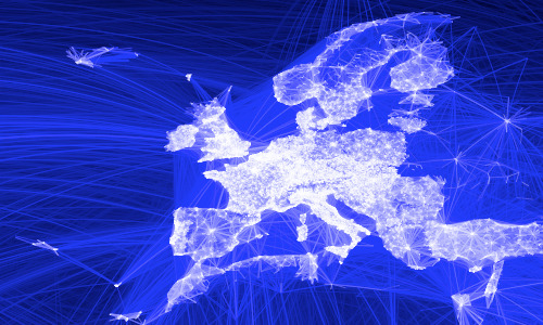
[…] After a few minutes of rendering, the new plot appeared, and I was a bit taken aback by what I saw. The blob had turned into a surprisingly detailed map of the world. Not only were continents visible, certain international borders were apparent as well. What really struck me, though, was knowing that the lines didn’t represent coasts or rivers or political borders, but real human relationships. Each line might represent a friendship made while travelling, a family member abroad, or an old college friend pulled away by the various forces of life.
(via Visualizing Friendships – facebook.com)
It would be interesting to see if this data could show communities like the PLoS One map of Great Britain. As it stands, it’s very pretty, but I can’t see much more than areas of high Facebook use…
(via Flowing Data)
Redrawing the map of Great Britain from a network of human interactions
In other words, these maps show how the borders of countries and counties could be redrawn if they were to reflect communities rather than governmental regions.
The geography of talk in Great Britain. This figure shows the strongest 80% of links, as measured by total talk time, between areas within Britain. The opacity of each link is proportional to the total call time between two areas and the different colours represent regions identified using network modularity optimisation analysis.
The core regions of Britain. By combining the output from several modularity optimization methods we obtain the results shown in this figure. The thick black boundary lines show the official Government Office Regions partitioning together with Scotland and Wales. The black background spots show Britain’s towns and cities, some of which are highlighted with a label.
via Redrawing the Map of Great Britain from a Network of Human Interactions – plosone.org (CC BY 2.5)
NYC sidewalk graffiti helps orient subway commuters
Some clever and helpful stencil artist has been putting compass graphics at subway exit points to help NYC commuters get their bearings. Initially spotted at one location, they have since been spreading throughout the city.
Fantastic pixel art maps
Gallery

This gallery contains 3 photos.
The attention to detail that has gone into these pixel maps is pretty stunning. Check out the reflections in the glass buildings! Anyone fancy helping me produce something similar for Cardiff? It should only take a few years…
Handy Cardiff Bus live departures map
Fellow Cardiff public transport users – you have my sympathies! Hopefully, the following post will mitigate your suffering.
Cardiff County Council provide a handy Google map that displays Cardiff bus departure information in real time:
From this site you can locate real-time bus departure information quickly and easily.
No more waiting around for late buses; by using GPS technology to monitor the movement of our vehicles, we can accurately predict the arrival of buses at our stops for several hours into the future.
Its cold, you should not be waiting for a bus for more than five minutes. We can help!
When you click on any of the stops, you will see a list of the next departures. What’s even more useful is you can detatch the little lists into separate windows and bookmark them, so you can keep an eye on your next bus home without having to load the map and find your stop every time. I have a few key pages bookmarked on my iPhone, which works nicely enough. A proper mobile version of this site would be extra useful.
The homepage gives you options to search by service number, stop number and postcode, so you can get the information without using the map. It’s all rather helpful and nicely done.
I notice Cardiff Bus don’t seem to link to the service, which is a shame.
My bad. Cardiff Bus do have a good links page, that I really should have seen. Thanks to the commenter below, who also points out that the map is not just for Cardiff Bus services.
[Updated 11th March 2010]
8-bit New York
8-Bit NYC is an attempt to make the city feel foreign yet familiar, smashing together two culturally common models of space: the lo-fi overhead world maps of 1980s role-playing and adventure games, and the geographically accurate data that drives today’s web maps and GPS navigation. I hope to evoke the same urge for exploration, abstract sense of scale, and perhaps most importantly unbounded excitement that many of us remember experiencing on the Nintendo Entertainment System, the Commodore 64, or any other number of 8-bit microcomputers. Maps offer us visual architectures of the world, encouraging us to think about and interact with space in particularly constrained ways. Take some time to think about New York a little differently. Set out on a quest. Be an adventurer.
BBC Interactive map: A decade of road deaths
From the BBC's Crash feature:
In 2008, 2,538 people died on Britain's roads, on average nearly seven every day. Using official data released by the Department of Transport, this map plots the location of every fatal road crash in Great Britain between 1999 and 2008, a total of 32,298 deaths.
Boundaries – a tool to visualise the shape of neighbourhoods
Boundaries uses Flickr geotagging data to draw local area boundaries on a map. It’s creator, Tom Taylor, says:
Flickr understands that places are more than unique geographic identifiers; that they are mental models people use to identify with location. Moreover, they are fluid and opinionated, varying based on a number of parameters such as context, ambition and personal background. In true wisdom of the crowds style, Flickr use the combined selections of their thousands of photographers to compute the shape of these places.
I think it’s a wonderful idea. Tom has several other fun projects, including the Flickr game Noticings, and a handy micro-printer you could use for to-do lists or hyperlocal news print outs. He also has a talk up on http://www.dolectures.com/ where he explores more ideas.
Mapumental
I watched a fascinating presentation on mapping technologies and their use in the BBC yesterday. The highlight for me was an amazing video showing all the Open Street Map edits made in 2008. The Channel 4 / MySociety / Stamen project, Mapumental was also demonstrated (well, just the Mapumental YouTube video actually).
It’s a really useful tool. Here I’m showing a few Cardiff examples.
Local crime mapping
This new local crime mapping service is public service on the web done right. You can easily locate your area, compare it to others, download the data as a CSV file and subscribe to updates via RSS.


