Obscure and invented punctuation marks

Andorpersand

An andorpersand

There’s something fascinating to me about obscure punctuation marks. I think it’s that I have great sympathy for smart people who attempt to solve problems that regular people don’t really care about.

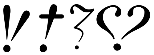
Flavorwire recently posted a roundup of interesting real punctuation marks (an article that seems to have been cribbed from an older mental_floss post actually). Most of these are the creations of Hervé Bazin who proposed new exclamation and question mark variations to signify acclamation, certainty, doubt, love and others.

Hervé Bazin's punctuation marks

Hervé Bazin’s proposed punctuation marks for acclamation, certainty, doubt and love

On the lighter side, College Humor has recently invented eight new punctuation marks (that it thinks) we desperately need.

Mockwotation marks

Mockwotation marks

The mockwotation marks are my absolute favourites. I would do away with the actual quotation mark elements and just keep the wavy hands.

Similarly, I wonder if there could be a fun use for an air quotes / scare quotes punctuation mark? I would use them to distance myself from some awful turn of phrase by indicating that it’s not something I would usually say.

Air quote punctuation marks

More punctuation fun →

Courier Prime: A free font for screenplays

Courier Prime is a free and open source monospaced typeface by Alan Dague-Greene. It’s an improved Courier, designed to be ‘less blobby’ with a bolder bold and real italics.

Courier Prime

Since the beginning, screenplays have been written in Courier. Its uniformity allows filmmakers to make handy comparisons and estimates, such as 1 page = 1 minute of screen time.

But there’s no reason Courier has to look terrible. We set out to make the best damn Courier ever.

Continue reading

Avería: The Average Font

Here’s an interesting generative typeface, created by averaging a large collection of fonts on a computer: Avería.

Avería

Then it occurred to me: since my aim was to average a large number of fonts, perhaps it would be best to use a very simple process, and hope the results averaged out well over a large number of fonts. So, how about splitting each letter perimeter into lots of (say, 500) equally-spaced points, and just average between the corresponding positions of each, on each letter? It would be necessary to match up the points so they were about the same location in each letter, and then the process would be fairly simple.

The result is a surprisingly readable typeface, with an appealing hand-drawn quality.

Continue reading

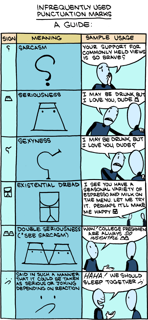
Point d’ironie⸮

I can’t see obscure punctuation like the ‘snark’ finding a place any time soon. People seem to have enough problems with the punctuation we already have. Besides, sarcasm symbol would instantly reduce the humour in the sarcasm – it’s a bit like explaining a joke.

Another mark, now obscure, is the point d’ironie, sometimes known as a “snark.” A back-to-front question mark, it was deployed by the 16th-century printer Henry Denham to signal rhetorical questions, and in 1899 the French poet Alcanter de Brahm suggested reviving it. More recently, the difficulty of detecting irony and sarcasm in electronic communication has prompted fresh calls for a revival of the point d’ironie. But the chances are slim that it will make a comeback.

Is This the Future of Punctuation!? – online.wsj.com

Continue reading

Link

A monstrously brilliant typography project:

Frankenstein hardback

An edition of Mary Shelley’s Frankenstein laid out using characters and glyphs from PDF documents obtained through internet searches. The incomplete fonts found in the PDFs were reassembled into the text of Frankenstein based on their frequency of use. The most common characters are employed at the beginning of the book, and the text devolves into less common, more grotesque shapes and forms toward the end.

fathom.info/frankenfont

Continue reading

Link

Off Book, Typography by PBS Arts.

In episode 2 of Off Book, typeface designers Jonathan Hoefler and Tobias Frere-Jones outline the importance of selecting the right font to convey a particular feeling. Graphic designer Paula Scher talks about building identity in messaging, while Eddie Opara uses texture to create reaction. Infographic designers Julia Vakser and Deroy Peraza map complicated data sets into digestible imagery, mixing color, graphics and type.

Flawed typefaces

Optimo Didot the Elder compared to Linotype Didot.

Optimo Didot the Elder compared to Linotype Didot.

What constitutes a flawed typeface? For this article it is defined as a typeface that is perfectly fine—except for one nagging aspect, usually a single character. A flawed typeface is one that either you avoid using entirely because of this lone defect; or one that you use sparingly—and only then, after some alteration of either your design or the face itself to ameliorate the “flaw”. Flawed typefaces are not bad or even mediocre. The whole premise here is that they are good, perhaps even classic or wildly popular. And yet there is a single character that ruins them or, at the very least, causes one to pause before specing them.

Flawed Typefaces – imprint.printmag.com

Can the art of a paedophile be celebrated?

He regularly had sex with two of his daughters, his sisters and even the family dog.

I did not know this! From a 2007 BBC News story:

Piece of work

For some of Gill’s fans, even looking at his work became impossible. Most problematically, he was a Catholic convert who created some of the most popular devotional art of his era, such as the Stations of the Cross in Westminster Cathedral, where worshippers pray at each panel depicting the suffering of Jesus.

In 1998, spurred on by a cardinal’s praise for Gill, Margaret Kennedy, who campaigns for Ministers and Clergy Sexual Abuse Survivors, called for the works to be removed.

“Survivors couldn’t pray at the Stations of the Cross. They were done by a paedophile. The very hands that carved the stations were the hands that abused.

“He abused his maids, his prostitutes, animals, he was having sex with everything that moved – a very deranged man sexually.”

But the Catholic Church would not budge an inch. The former Westminster Cathedral administrator, Bishop George Stack, retains an unequivocal view.

“There was no consideration given to taking these down. A work of art stands in its own right. Once it has been created it takes on a life of its own.”

It might be easier to make this argument for the Stations of the Cross than for nude sketches of Gill’s teenage daughter.

via Can the art of a paedophile be celebrated? – news.bbc.co.uk

What the hell(vetica)?

What the hell(vetica)?

Helvetica parentheses comparison I was just knocking together a new title graphic for this blog, when I noticed that the parenthesis in Helvetica bold were asymmetrical. Perhaps I only noticed because I was working at a very large size, but the difference is significant and it really stood out.

Google didn’t give me any immediate answers, so I guess I’m going to have to do some proper research on this. Best guess: It looks better at a smaller size somehow.

Dalton Maag are killing Helvetica and going open source

Aktiv Grotesk

I was lucky enough to see Bruno Maag talk at the Millenium Centre last year at a Cardiff Design Festival talk. He was interesting, entertaining, and although he was mainly talking about the challenges of designing non-western type, he still managed to get a little dig in about Helvetica. In this video he goes into more length on the subject of Helvetica’s general unworthiness:

As someone who is still newly interested in type design, it’s inspirational to hear someone talk so passionately on the differences between what are to the untrained eye, almost identical copies of each other. And with all this Helvetica bashing, presumably he’s been told more than once to ‘put up or shut up’. So he has.

Dalton Maag, detail Aktiv Grotesk is a new font family designed to replace Helvetica entirely (for the sum of £222.77). Creative Review has a great interview with Bruno Maag with some interesting theories on how the inferior Swiss font became so popular anyway:

People just use Helvetica because they have heard of it, it’s on everyone’s computer and everyone else uses it.

The Ubuntu Font

The new Ubuntu typeface, by Dalton Maag

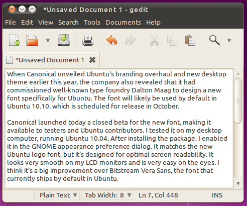
When Canonical unveiled Ubuntu’s branding overhaul and new desktop theme earlier this year, the company also revealed that it had commissioned well-known type foundry Dalton Maag to design a new font specifically for Ubuntu. The font will likely be used by default in Ubuntu 10.10, which is scheduled for release in October.

(via Ars Technica)

This is even better news though – a high quality open source typeface, built to suit the new Ubuntu branding also created by Dalton Maag. As you would expect from an open source project, the font is currently in beta and has just been opened for ‘bug testing’ on the Canonical Design blog.

I hope both parties here can learn some lessons. The open source movement really needs to learn the value of good visual design, and if Dalton Maag are serious about wiping Helvetica off the face of the planet, they could certainly make use of the FOSS model for distributing Aktiv Grotesk. I can’t think of a quicker way of getting it onto everyone’s computer.
Continue reading

My first attempt at an original typeface design

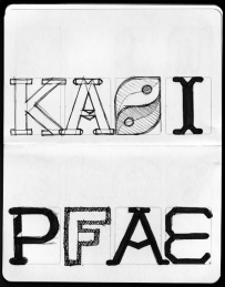
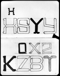
This is still early days, but it’s starting to come together. My major reservation is that it looks a little – familiar. I’m a bit worried I may be unconsciously imitating another font I have seen. It has a certain T26 vibe.

Geronimo! Adventures in Space and Type: Part 2

Progress report for day two of the ‘Geronimo!’ Doctor Who font experiment. Most of it is basically there, but I’m pretty unhappy with some of the details. Nothing like kerning has even been attempted here, this is literally just so I can see how the whole alphabet looks.

Now I need to work on how to make the difficult characters (B, G, Q, Y, V) work, and what, if anything, I can do to improve the bland characters (E, F, S, Z).

I still plan to do numbers and some of the more essential special characters(“, &, #, ~, @, +, – and parentheses).

Geronimo! Adventures in Space and Type: Part 1

This evening I’ve been playing around in Inkskape, trying to reproduce the typeface used in the new Doctor Who logo. If I finish it, I’ll set it free on the internet for the Whovians to play with. I picked it mostly because it’s a nice simple design. I plan to call the font ‘Geronimo’.

On closer inspection, I’ve started to take a strong dislike to this new logo. I find the ‘DW’ TARDIS shape to be huge and ugly, but even the letters themselves seem to have some funny issues. Look at the third slide attached to this post, or go and find a larger version of this image on the BBC site. The H‘s right leg is thicker, and the O is not symmetrical vertically! The W is just so ugly I’m reluctant to draw it, and I have no idea why they made the R like they did.

Anyway, I’m going to be faithful to what they’ve done here, but I’ll probably build in an alternate character set with my own ‘improvements’.

Link

:—

Citing usage from 1949, the OED calls this mark the dog’s bollocks, which it defines as, “typogr. a colon followed by a dash, regarded as forming a shape resembling the male sexual organs.” This is why I love scrounging around the linguistic scrap heap that is the OED. I always come across a little gold. And by “gold,” I mean, “vulgar, 60-year-old emoticons.”

(via The Secret History of Typography in the Oxford English Dictionary – bygonebureau.com)

A great article for budding archetypists and palaeotypographists!

FontForge – Other ways to build a typeface in Linux?

FontForge I have always had the ambition to design typefaces, but besides reading several books on the subject and creating one (very rough) font, I’ve not made any progress.

Well, I still haven’t, but I have just installed FontForge. After much digging, it seemed to be the only real option for Linux (not that other Mac and Windows are exactly overflowing with options). I’m know Inkscape has some type-specific features – and I plan to explore these – but I really wanted to try a dedicated program. Continue reading