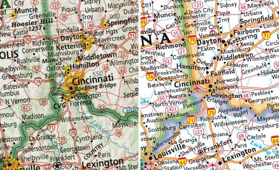
Created by over two years, Slate explains what made David Imus’ map The Essential Geography of the United States of America the Best of Show at the annual competition of the Cartography and Geographic Information Society.
[…] David Imus worked alone on his map seven days a week for two full years. Nearly 6,000 hours in total. It would be prohibitively expensive just to outsource that much work. But Imus—a 35-year veteran of cartography who’s designed every kind of map for every kind of client—did it all by himself. He used a computer (not a pencil and paper), but absolutely nothing was left to computer-assisted happenstance. Imus spent eons tweaking label positions. Slaving over font types, kerning, letter thicknesses. Scrutinizing levels of blackness. It’s the kind of personal cartographic touch you might only find these days on the hand-illustrated ski-trail maps available at posh mountain resorts.
A few of his more significant design decisions: Your standard wall map will often paint the U.S. states different colors so their shapes are easily grasped. But Imus’ map uses thick lines to indicate state borders and reserves the color for more important purposes—green for denser forestation, yellow for population centers. Instead of hypsometric tinting (darker colors for lower elevations, lighter colors for higher altitudes), Imus uses relief shading for a more natural portrait of U.S. terrain.
(via The Greatest Paper Map of the United States You’ll Ever See – slate.com)
Updated 2012.01.03: To include a few more pictures of the map from Imus Geographics‘ website, which was down yesterday.
In a speech given to the North American Cartographic Information Society, Imus said:
We have work to do with our art. As cartographers, we create what educators recognize as geography’s most basic educational tool, the map; yet in Canada, Mexico, and the US geographic illiteracy is epidemic. In the United States half our young adults cannot locate New York City on a US map, and 60% cannot locate the state of Ohio. One study showed that 25% of Dallas, Texas high school seniors couldn’t name the country that borders the United States to the south. In the last few weeks I learned that some American adults think Alaska is an island. I hope you will join me in believing that these things mean cartographers have work to do.


Pingback: The best American wall map: David Imus’ “The Essential Geography of the United States of America” – Slate Magazine | Odds and Ends: Pit's Complete Waste of Bandwidth
Beautiful job. But, how about this one? I purchased the National Geographic Society’s “Everest World Globe” for more than $5,000. It is a grand affair map on a glass globe made in Germany. And, it sits in a beautifully finished wood base/surround-stand, waist high. Around the perimeter of the wood surround are the months of the year inlaid in mother of pearl. Also inlaid are the four directions: N, S, E, and W. The globe is correctly tilted on its axis.
One day my brother was studying the globe when he noticed that both the summer solstice and winter solstice points were set wrong. Hard to believe, but, they are set at April and October.
By coincidence, I had a friend who worked at the National Geographic and I called to tell her of the amazing error. She in turn had the Chief of the Cartography Section call me. The fellow began by telling me that he had no record of my owning an “Everest Globe”. When I told him the name on the order, the conversation continued.
After explaining the error to the fellow, there was a stunned silence on the phone. When he regained his composure his mind went into high gear, telling me that the inlays were just historical representations and had nothing to do with actual references.
I ended the conversation by telling the fellow that I understand that the Summer Solstice and the Winter Solstice were just old ideas and not to be taken as facts.
Also, that I did not want the globe corrected as I considered it to be a Collector’s Item of great value.
Imagine, I have a major offering of The National Geographic Society that can not align the tilt of the earth to June and December. Best of all, The Society denies that such an artifact even exists.
It is good to have a such detailed map on your wall. Yes it seems it is the most deatiled and cartographicaly beautiful map of America. I have heard about the map from the internet, by a newsletter. It seems that the attantion to the map rised since it is an award winning map. There are many articles and news on the internet about the map, and also a pdf file with the comparisons on https://imusgeographics.com/ . As a cartographer I can say that it is a “beatiful map”, with most detailed information. I would like to have one to see the map print quality. Many political maps shows the boundaries with different colours, but it is a courage to use single green colours for the borders. Becouse there is an axpectation on the users that the boundaries will be coloured. But this green single colour makes the map easy to use. I want to make a polical map of Turkey and a road map of Turkey with the physical map details in that style. I will soon put this political map on http://www.pusulaharita.com and also map prints for sale on http://www.mapist.com.tr.