
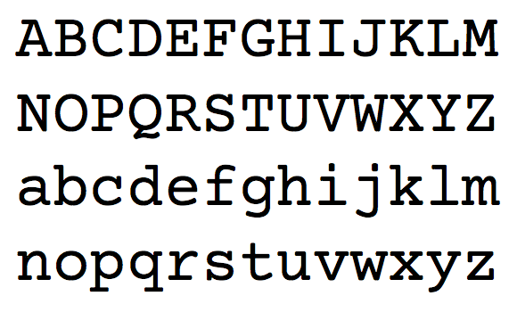
Courier Prime is a free and open source monospaced typeface by Alan Dague-Greene. It’s an improved Courier, designed to be ‘less blobby’ with a bolder bold and real italics.

Since the beginning, screenplays have been written in Courier. Its uniformity allows filmmakers to make handy comparisons and estimates, such as 1 page = 1 minute of screen time.
But there’s no reason Courier has to look terrible. We set out to make the best damn Courier ever.
Courier Prime was commissioned by John August. I’ve excerpted some interesting passages from his introductory blog post:
The Courier typeface was designed in 1955 by Howard “Bud” Kettler for IBM. It’s classified as a monospaced slab serif, with each character taking up the same space and constructed with even stroke widths. IBM deliberately chose not to seek any copyright, trademark, or design patent protection on Courier, which is why it’s royalty free. It was the standard typeface on IBM’s best-selling Selectric II typewriter, and soon became the default typeface in Hollywood.
Alan [Dague-Greene] rose to the challenge, creating a typeface that is unmistakably Courier, but subtly improved in ways you wouldn’t necessarily notice at first.
The serifs are crisper and less rounded. They’re also less blobby where the serif connects — particularly in the lower-case c.
[In early testing] Screenwriters consistently preferred standard Mac Courier to our custom face. But we soon realized why: the standard Mac Courier is fairly heavy. Screenplays have a lot of white space, which makes thin Couriers look even thinner. As we gradually nudged up the stroke weight, we found the Goldilocks spot which was just right.
This could also be an alternative for coders who have a fondness for Courier. A web font is in the works too.
