The Adventures of Boggle, the Creative Commons penguin

If you do a Google search for cartoon penguin, one of the top results will be an old Inkscape design of mine:

He’s pretty popular too, bringing a steady stream of traffic to the site. I licensed him as Creative Commons BY-NC-SA, meaning that it’s fine to use the image for forum avatars and stuff, but not for anything commercial.

Of course, people do. Last year someone pointed out some guy selling t-shirts with a slightly modified version of the penguin.

Today, out of curiosity, I did a reverse image search and found two other clipart criminals…

Continue reading

The evolution of the web

Here’s another infographic that looks pretty, but fails at conveying information in any useful way: The Evolution of the Web.

[…] To pay homage to the goodness of the web, we’ve put together an interactive infographic, built in HTML5, which details the evolution of major web technologies and browsers:

via Happy third birthday, Chrome! – googleblog.blogspot.com

I understand the timeline aspect, showing major revisions, but what are the coloured lines illustrating? According to the page:

The color bands in this visualization represent the interaction between web technologies and browsers, which brings to life the many powerful web apps that we use daily.

Which sounds a bit hand-wavy to me. Lets look at the interaction of JavaScript with web browsers in more detail, for example:

Continue reading

Cardiff Rorschmap

Cardiff Rorschmap

Do these streets look familiar?

Rorschmap screenshots taken of various Cardiff locations. Continue reading

Redesigning news

There has been plenty of interesting discussion about the Andy Rutledge NYT/News redux mockup I linked to a few days ago:

Beautiful by itself isn’t that hard — there are lots of beautiful sites on the web, and lots of talented designers. When it comes to effective story discovery, the innovation has all been in the direction of algorithms and raw feeds. An algorithm is how Facebook surfaces items in your News Feed; a raw feed is how Twitter organizes tweets from the people you follow, in straight reverse chronological order. But neither of those is perfect for human editorial control, which is something news organizations rightly value; there are tons of visual and contextual cues on those complicated nytimes.com pages that tell me what Times editors think is more or less important for me to see.

(via Designing a big news site is about more than beauty – niemanlab.org)

While Nieman Journalism Lab approached from a journalist’s perspective, Paul Scrivens on Drawar takes a designers view: 

Why can’t news agencies get on the ball and realize they are missing a great opportunity to leap ahead of their competition? Whenever you read about the newspaper industry all you hear about is the decline of revenue and how all papers will soon disappear. Everyone is fighting for eyeballs and the way they do it is by looking exactly like their competition?

Now I know it doesn’t have as much content as the NYT, but don’t you wish that more news sites looked like Gapers Block? Would you ever have a problem going to a beautiful site like that to catch up on what is happening today? Hell, wouldn’t you go back to check even more just because of the pleasant design? We are forced to go somewhere if we want our news and that is what is keeping these horrible news sites alive.

Is it wrong to like the Rutledge redesign? Of course not. It is a beautifully laid out page and the aesthetics are spot on, but I just think news sites need a bit more treatment than what we can get from a blog format. This may requires a whole new line of thinking that we haven’t seen before and I do believe the NYT is on the right path with Skimmer. The site itself probably publishes hundreds of news items a day. The current version of their homepage is how they believe they should handle passing all of the information to their audience. It doesn’t make it right, but it helps to show their line of thinking.

(via Redesigning And Re-Thinking The News – journal.drawar.com)

My posts here tagged news are, IMO, some of the most interesting on this blog. This post is a follow-up to News redux: Fixing news presentation online, and I expect to be posting some more ideas I have on this subject soon, in the same vein as my Permanews: Old news is good news post.

See also:

News redux: Fixing news presentation online

In working to more appropriately re-imagine digital news, I believe we must first address some fundamental failings of modern news. Among the ideas that need to be addressed are:

  • Headlines should describe, inform, and be powerful. They should be the workhorse of the publication.
  • There is no “edition.” All news is global. All news is local. “Global Edition” and “Local Edition,” etc… are non sequiturs. Navigation and filters should be rational and easy to use.
  • There is no “most popular” news. There is news and there is opinion and they are mutually exclusive. Popularity of stories is something not contextual to news sites, but to social media sites.
  • News is not social media. If it is, it fails to be news.
  • Those whose news reporting is of low quality avoid the marketplace and instead concentrate on the mob/opinion arena.
  • Quality news is valuable. It must therefore have a cost. Quality news is subscription only. You pay for valuable information. Fluff you get for free.
  • Quality news requires quality presentation, free from the ridiculous array of experience-destroying marketing. Payment for the PRODUCT allows for this to happen. Experience-destroying penalties for getting the product for free create a broken system while at the same time destroying the value proposition for payment.

(via News Redux – andyrutledge.com)

This is interesting to me, as I’ve been working on a WordPress theme for news sites, which I think has some nice innovations. I agree with a lot of what Andy Rutledge says, but it’s pretty clear that fixing news design on the web isn’t going to be as easy as he thinks:

Martin Belam also wrote a post about the four key pieces of audience engagement missing from Andy Rutledge’s news redux (I recommend you read the whole piece).

  1. Faces matter. The fake redesign doesn’t use any photos except in the lead image and columnist mugshots. If people are going to engage with a page, they need to be  guided by faces of people in the stories, not faces of people writing the stories.
  2. Users want brief summaries. Users read summaries and expect them. Headlines alone won’t suffice.
  3. Navigation is more than links. It’s about setting the editorial standards of a news site.
  4. News is social. The redux gets rid of any social tools, saying “popularity has nothing to do with news.” Wrong.

(via Fake New York Times Redesign Gets Torn To Pieces On Twitter – mediabistro.com)

Continue reading

Graphs speak louder than numbers

With President Obama and Republican leaders calling for cutting the budget by trillions over the next 10 years, it is worth asking how we got here — from healthy surpluses at the end of the Clinton era, and the promise of future surpluses, to nine straight years of deficits, including the $1.3 trillion shortfall in 2010. The answer is largely the Bush-era tax cuts, war spending in Iraq and Afghanistan, and recessions.

(via How the Deficit Got This Big – nytimes.com)

Depressing.

The 20 most expensive keywords (and another misleading infographic)

This infographic shows that just over half of the top AdWord keywords fall into insurance and loans categories … but hang on … 24% and 12.8% add up to 36.8%, not 50% or more. I’ve knocked up a quick chart in Numbers showing what I think the pie should look like in reality. Am I missing something? Why would somebody even want to misrepresent that data? So they can overcharge finance companies for SEO work?

Still, the data itself is quite interesting (if you still trust it):

The 20 keyword categories with the highest search volume and highest costs per click, thereby netting Google the most money, are:

  1. Insurance (example keywords in this category include “buy car insurance online” and “auto insurance price quotes”)
  2. Loans (example keywords include “consolidate graduate student loans” and “cheapest homeowner loans”)
  3. Mortgage (example keywords include “refinanced second mortgages” and “remortgage with bad credit”)
  4. Attorney (example keywords include “personal injury attorney” and “dui defense attorney”)
  5. Credit (example keywords include “home equity line of credit” and “bad credit home buyer”)
  6. Lawyer (“personal  injury lawyer,” “criminal defense lawyer)
  7. Donate (“car donation centers,” “donating a used car”)
  8. Degree (“criminal justice degrees online,” “psychology bachelors degree online”)
  9. Hosting (“hosting ms exchange,” “managed web hosting solution”)
  10. Claim (“personal injury claim,” “accident claims no win no fee”)
  11. Conference Call (“best conference call service,” “conference calls toll free”)
  12. Trading (“cheap online trading,” “stock trades online”)
  13. Software (“crm software programs,” “help desk software cheap”)
  14. Recovery (“raid server data recovery,” “hard drive recovery laptop”)
  15. Transfer (“zero apr balance transfer,” “credit card balance transfer zero interest”)
  16. Gas/Electricity (“business electricity price comparison,” “switch gas and electricity suppliers”)
  17. Classes (“criminal justice online classes,” “online classes business administration”)
  18. Rehab (“alcohol rehab centers,” “crack rehab centers”)
  19. Treatment (“mesothelioma treatment options,” “drug treatment centers”)
  20. Cord Blood (“cordblood bank,” “store umbilical cord blood”)

Continue reading

Free Museum San Francisco

Free Museum San Francisco

This guide called The Free Museum San Francisco is a public art tour of the city designed and curated for Arkitip Intel’s Newspaper Supplement. The only caveat being that it requires a bit more will-power (or, ideally, a bike) to view. Each artist is distinguished by a unique pattern and demarcated in the legend of the map.

Side note: this was the first printing of Mike Abbink’s Milo Serif typeface, which holds its own on the page, even when competing with an eclectic mix of patterns. Kyle is hard at work on the annotated espresso version of the tour.

(via Free Museum San Francisco – everything-type-company.com)
Continue reading

Flawed typefaces

Optimo Didot the Elder compared to Linotype Didot.

Optimo Didot the Elder compared to Linotype Didot.

What constitutes a flawed typeface? For this article it is defined as a typeface that is perfectly fine—except for one nagging aspect, usually a single character. A flawed typeface is one that either you avoid using entirely because of this lone defect; or one that you use sparingly—and only then, after some alteration of either your design or the face itself to ameliorate the “flaw”. Flawed typefaces are not bad or even mediocre. The whole premise here is that they are good, perhaps even classic or wildly popular. And yet there is a single character that ruins them or, at the very least, causes one to pause before specing them.

Flawed Typefaces – imprint.printmag.com

Eureka magazine

Eureka magazine

The second issue of Eureka — a new science supplement to The Times — is out and it’s looking like a design classic in the making. Matt Curtis (art direction), Matt Swift (information graphics), and David Loewe (design) comprise the design team for the new publication. Going to have to track down a copy for myself.

Browse the full issue here

via blog.iso50.com
Continue reading

QRobots: A QR code alternative with personality

QR Codes are a great idea but they are big and ugly. You can customise them to a degree, but they still lack personality. For example, here are some I made to print as Moo stickers:

There is also the Microsoft tag, but that looks even worse.

I wonder if it would be possible to create another type of code that works in the same way, but instead of generating a random checkerboard pattern, it created some kind of face. I’ve quickly drawn up two examples of what these could look like (at the top), but I imagine a much more detailed/abstract look would be required to accommodate the amount of information they would need to contain.

Continue reading

Google’s Jules Verne doodle: The whole picture

The novelty value of the Google Doodles is starting to wear thin. What used to be an amusing quirk of the company has now become a regular occurrence. It’s interesting to look at the kind of topics they choose to give the doodle treatment too: Nothing overtly religious (not even Christmas) and nothing likely to be at all controversial, but it’s fine to promote Scooby Doo or run a weeks worth of Sesame Street doodles.

Still, they do some good stuff, and today’s interactive 20,000 Leagues themed Jules Verne doodle is particularly nice. It’s also fantastic that they use web native technologies, and don’t just slap up some Flash movie. The geekier doodles are brilliant too, especially the Pac-Man one, if only because of the chaos it caused.

The above picture is not entirely accurate because I didn’t edit too much to account for the parallax effect. And here is the image sprite that makes up the frame:

Continue reading

Adventures in WordPress theming

I’ve been a bit quiet on this blog and Twitter for a week or so now because I’ve been concentrating on a few personal projects:

A WordPress theme for hyperlocal bloggers

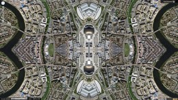
This one is just a Photoshop mock (the provisional name ‘The Local’ is going to have to be changed as I since found another theme with that name), but I’m quite pleased with the look and feel of it all. I wouldn’t usually do a mockup like this, but as I’m going to be learning WordPress theme creation from scratch, I didn’t want to have to be worrying about the design at the same time.

About halfway through creating this I realised it looked very BBC-ish. I’ll probably just try to give it a different default colour scheme to combat this.

The design has a lot of space for different widgets and I plan to give the nameplate area a lot of configuration options so no two of these blogs should look alike. 

One feature I quite like, but you can’t really see in this mock, is the image copyright ID icon. In the bottom right corner of the main cathedral pic, there’s a CC licence symbol. I imagine that when you hover over this, a full credit will pop up over the picture, with link to the source, etc. It seems like a neat solution to me, and not one I’ve seen elsewhere.

I’ve stalled work on this for the time being as I wanted to get my second project up and running first…

Continue reading

Extend battery life with finger power

[…] a helpful solution for a tricky situation. The situation being: you running out of juice on your mobile phone. So what do you do? Remove the battery from the back of the phone; give it a few good turns around your index finger and its gathered enough power to last you a conversation or a safe trip to your charger and electric point.

(via Cheers To Finger Power! – yankodesign.com)

Clever.

Informationless graphics

A picture is worth a thousand words right? But what about a picture AND a thousand words? Whoa. You may just have an infographic on your hands.

From airline safety manuals to complex data visualizations, I have always been fascinated by infographics. A well done infographic has the power to capture one’s acute attention span and convey information that would have taken longer to simply read (oh no, not reading!). However, for every brilliantly thought out and well executed mashup of art and data, there now seems to be an influx of mundane and formulaic counterparts infesting the very internet that we hold so near and dear.

(via An Intimate Look at Infographics – thinkbrilliant.com)

The backlash against pointless infographics has begun. Let’s speed this one along…