500px and Fotomoto send out “he said, she said” emails to users

Tonight I recieved an email from 500px telling me that they will be removing their photo stores because their partner, Fotomoto ‘does not quite satisfy our high demands for quality of the user experience’. An hour later, Fotomoto sent an email of their own, countering that ‘500px didn’t meet their business and technical commitments’, and it was their call to terminate the contract with 500px.

I like the 500px service, but sizing up these two emails (published below) it does seem like they may not be trustworthy. Which is a shame, as it’s a service I decided to pay for.

Continue reading

Advertisement

Rabbit Island: Bought on Craigslist, turned into an artist community with Kickstarter

In February of 2010, Rob Gorski (NYC) and Andrew Ranville (UK) purchased a 90 acre island on Craigslist (seriously), 3 miles off the coast of Michigan’s Keweenaw Peninsula. They recently ran a Kickstarter which was funded to facilitate their plan to build an Artist Residency on the island. This island is virtually untouched as it stands. Rob and Andrew are breaking ground this summer to build a single small cabin which will house resident visual artists, musicians, and writers. Best Made Co. threw ‘em some gear too.

(via coldsplinters.com)

I fantasise about projects like this.

SEO for non-dicks

The key thing to understand is that the rules of SEO aren’t magic or arbitrary. They’re based on the goals of a search engine, which is to find relevant results. Relevance implies genuineness, and genuineness implies trust. So, shockingly, you should try to make your site’s content trustworthy, genuine and relevant. All of the rules have come about due to their utility in detecting those three positive metrics. Good SEO is a by-product of not being a dick on the internet.

(SEO for Non-dicks – mattgemmell.com)

File under things that are very true.

Posted in SEO

Link

Off Book, Typography by PBS Arts.

In episode 2 of Off Book, typeface designers Jonathan Hoefler and Tobias Frere-Jones outline the importance of selecting the right font to convey a particular feeling. Graphic designer Paula Scher talks about building identity in messaging, while Eddie Opara uses texture to create reaction. Infographic designers Julia Vakser and Deroy Peraza map complicated data sets into digestible imagery, mixing color, graphics and type.

Link

I’m always sending myself notes via email – in fact I have a special Gmail account just for to-do and to-read items. This cc:to me bookmarklet will make it loads easier to send myself links to websites I want to check out later. I can even include text and images just by dragging it off the page and into the bookmarklet. It’s very slick.

The only flaw I can see is that it doesn’t use the subject line. Ideally, it should at least put the page title in there for quick reference.

(via The Next Web)

Link

The future of old media?

Quarterly Co. is a subscription service that lets you receive awesome things in the mail. You can subscribe to people you find interesting and, once every three months, they will send you a package right to your doorstep.

The Adventures of Boggle, the Creative Commons penguin

If you do a Google search for cartoon penguin, one of the top results will be an old Inkscape design of mine:

He’s pretty popular too, bringing a steady stream of traffic to the site. I licensed him as Creative Commons BY-NC-SA, meaning that it’s fine to use the image for forum avatars and stuff, but not for anything commercial.

Of course, people do. Last year someone pointed out some guy selling t-shirts with a slightly modified version of the penguin.

Today, out of curiosity, I did a reverse image search and found two other clipart criminals…

Continue reading

WordPress.com vs. Posterous

It’s been a week since I switched this blog from Posterous to WordPress.com. I’m very happy with the change, but it is clear to me that Posterous offer very compelling features for a free service.

What follows isn’t a complete comparison of the two services, it just highlights what I consider the most important differences between the two services for a typical blogger.

WordPress.com Posterous
Big library of free themes (100+). Premium themes. No custom themes. Decent library of free themes (46). No premium themes. Custom themes.
Custom domain mapping ($12 per year). Free custom domain mapping.
Regular users may see ads on your blog. Signed in WordPress.com users won’t. ($29.97 to remove.) No on-site advertising.
No direct HTML editing. CSS access paid upgrade ($30 per year). Full free access to HTML and CSS.
Image-heavy posts are a pain to manage. Excellent, intuitive image galleries.
Excellent, but expensive HD video support (VideoPress: $60 per year). Free video uploads (100MB per video limit).
A basic stats tool in the dashboard. No export functionality. No Google Analytics support. Support for Google Analytics.
Threaded comments. No threaded comments.
Fantastic commenting and comment moderation features. Comments can be a bit buggy for users. Poor moderation features.
Both services offer great customer support and have good iPhone and Android apps.
Neither service permits the use of JavaScript.

Note that I stopped using Posterous just before it transformed into Posterous Spaces. Their blogging service remains basically unchanged, so these points are still valid, but there is now a whole social aspect you may want to consider.

Continue reading

Site traffic: Posterous vs. WordPress.com

Aside

Curiously, I seem to be getting much more traffic now I’m hosting this blog on WordPress.com. I used to get 100-200 visits per day on Posterous, but now I’m seeing 200-300.

It could be a simple reporting difference, but I know from personal experience that Posterous could be slow to the point where the page never finished loading. I wonder if it regularly prevented the Google Analytics script at the end of the page from getting loaded?

Continue reading

A Dribbble for writing

Dribbble is a community site for very talented graphic designers. It’s not their role to debate these details. I would love to see a Dribbble for writing. A place where I can post the latest Intercom broadcast, email, even a sentence from the interface and get feedback. “You can strip the word currently there.“, “The important word here is buried in the middle of the sentence!“. “The message makes sense, but what I am supposed to do next?“.

(via The Language of Interfaces – contrast.ie)

A clever idea. I could see this being useful outside of UX circles. Perhaps for crafting the perfect marketing tweet or optimising a paragraph for SEO? I could even see some ways to make this profitable…

A call to abolish collective worship in schools

The National Assembly for Wales have put up an e-Petition to abolish collective worship in schools:

As it stands, the law requires all schools to hold an act of collective worship every day. Even in schools that aren’t ‘faith’ schools, this must be ‘broadly Christian’ in character. In a society which is increasingly diverse, this is an affront to the rights of young people to express their beliefs freely. Although there is the opportunity to opt out, this is reliant on parental permission and is not respected by all schools. The law is extremely unpopular, with opinion polls showing teachers don’t want it, parents don’t want it, and children don’t want it. As such, it is long past time for the daily act of collective worship to be replaced with inclusive assemblies that add to cohesion and a sense of community within the school. We petition the Government to repeal the requirement for compulsory collective worship in schools and to encourage schools to hold educational assemblies that will include all children, regardless of religion or non-religious belief.

Long overdue. One of my main memories of Torpoint School was of myself and a friend being punished by a particularly nasty geography teacher after failing to sing along in an assembly. He forced us to sing ‘Onward Christian Soldiers’ in front of his next (much more senior) class.

Continue reading

Static brands don’t belong on Twitter. Discuss.

I just asked a question on Twitter:

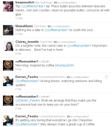
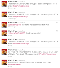
Static brands like Coffee #1 and Clark’s Pies are very dull on Twitter. Besides running promos and RTing complements, what else can they do?

Now, I don’t mean to call out Coffee #1 or Clark’s Pies in particular. (I happen to love coffee and pies, though not necessarily together!) Both of these brands are small, local companies who are interacting with followers. They look and sound professional, and are probably doing everything a ‘social media expert’ would recommend. But the experience of following them can be, to choose a charitable word, repetitive.

Should brands like these be on Twitter? What better ways could static brands take advantage of a fast-moving medium?

The Museum of Obsolete Objects

The Museum of Obsolete Objects is a snazzy YouTube channel:

Sadly, as our daily lives become more and more digital some things fall by the way side as they are replaced by newer, «better» devices.
Let us not forget those fallen appliances, tools and gadgets and relive those bygone times by taking a visit to The Museum of Obsolete Objects. Step inside to step back in time!

Continue reading