Geronimo! Adventures in Space and Type: Part 2

Progress report for day two of the ‘Geronimo!’ Doctor Who font experiment. Most of it is basically there, but I’m pretty unhappy with some of the details. Nothing like kerning has even been attempted here, this is literally just so I can see how the whole alphabet looks.

Now I need to work on how to make the difficult characters (B, G, Q, Y, V) work, and what, if anything, I can do to improve the bland characters (E, F, S, Z).

I still plan to do numbers and some of the more essential special characters(“, &, #, ~, @, +, – and parentheses).

Geronimo! Adventures in Space and Type: Part 1

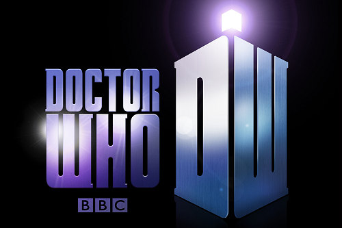
This evening I’ve been playing around in Inkskape, trying to reproduce the typeface used in the new Doctor Who logo. If I finish it, I’ll set it free on the internet for the Whovians to play with. I picked it mostly because it’s a nice simple design. I plan to call the font ‘Geronimo’.

On closer inspection, I’ve started to take a strong dislike to this new logo. I find the ‘DW’ TARDIS shape to be huge and ugly, but even the letters themselves seem to have some funny issues. Look at the third slide attached to this post, or go and find a larger version of this image on the BBC site. The H‘s right leg is thicker, and the O is not symmetrical vertically! The W is just so ugly I’m reluctant to draw it, and I have no idea why they made the R like they did.

Anyway, I’m going to be faithful to what they’ve done here, but I’ll probably build in an alternate character set with my own ‘improvements’.

Is there any good reason to use title case?

The convention followed by many British publishers (including scientific publishers, like Nature, magazines, like The Economist and New Scientist, and newspapers, like The Guardian and The Times) is the same used in other languages (e.g., French), namely to use sentence-style capitalization in titles and headlines, where capitalization follows the same rules that apply for sentences. This convention is sometimes called sentence case where a term is desired to clarify that title case shall not be applied. It is also widely used in the United States, especially in bibliographic references and library catalogues. Examples of global publishers whose English-language house styles prescribe sentence-case titles and headings include the International Organization for Standardization.

(via en.wikipedia.org)

I’ve developed the habit of using sentence case for headlines, but now I’m facing a situation where I’m probably going to have to adapt to a new style guide and start using Title Case at work. I’ve developed a strong preference for sentence case, and now find title case to be ugly and tabloid-esque.

It seems likely to me that title case is a hangover from the days of more primitive typesetting, when you would need to distinguish between BIG HEADLINES, Important Headlines, and regular text.

In these days of HTML and CSS, is there really any good reason to use title case?

Link

:—

Citing usage from 1949, the OED calls this mark the dog’s bollocks, which it defines as, “typogr. a colon followed by a dash, regarded as forming a shape resembling the male sexual organs.” This is why I love scrounging around the linguistic scrap heap that is the OED. I always come across a little gold. And by “gold,” I mean, “vulgar, 60-year-old emoticons.”

(via The Secret History of Typography in the Oxford English Dictionary – bygonebureau.com)

A great article for budding archetypists and palaeotypographists!

Retro cassette icon freebie #Daily365

Today’s daily design is an icon of an old cassette tape. I’m making the actual SVG vector file available with this post in an attached ZIP file (I think Posterous does something sensible with those!)*. I consider it free to use for any non-profit reason.

It generally follows the principles of the Tango icons, commonly used on Linux’s Gnome desktop, but I haven’t exactly paid close attention to their guidelines.

* Note 2011.10.13: This post was written at a time when this blog was hosted on Posterous, who offered hosting for small data files like this. Leave a comment if you want a copy of this icon, and I’ll Dropbox it for you.

Password incorrect #Daily365

Conceptually this one is a bit weak, but this is a technique I’ve been wanting to try for a while. I wish I had put a bit more personality into the poses, especially the 6 who should at least be shaking his fist!

The robots already existed, but the rest of the composition and rendering took exactly an hour.

Bath time #Daily365

Today’s daily design makes use of my earlier penguin cartoon, and adds another little guy who looks like he wanted a bath. I’ve tried to reference a little of the style of old-school animations, by making it look like the background was painted on a separate layer. Sadly, the direction of light is inconsistent on these two because I drew the smaller chap facing the other way and flipped him at a later stage, when I didn’t have the time or inclination to redraw the shadows.

I know: excuses, excuses.

Welsh Twitter dragon #Daily365

A bit of a cheat today – this design wasn’t created entirely this evening. In fact, it’s about three evening’s work (see other posts from last September).

Tonight, I changed the eyebrow so he looks less angry (I actually preferred that look, but had several negative criticisms), finalised the palette using a nice scheme from Colour Lovers and added a bit of canvas texture in GIMP.

Of course, I’m not the only one doing these daily designs – check out ‘Of Science and Beauty‘ for some really nice science themed illustrations.

The Bold Italic: Covering local stories, venues and events with style

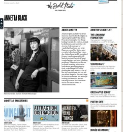
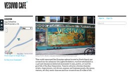
The Bold Italic is not about typography. It’s not a news site either, but it feels like one – albeit a very trendy news site. In fact, it’s about ‘local discovery’ – trendy San Francisco types write about their local obsessions. Venues, merchants and events are also covered. From the about page:

Just when you thought you were a pretty savvy local, along came The Bold Italic. Our mission is to help people become better locals, equipping our members with rare local intel, backstory and potential adventures.

Our writers, the Bold Locals, find their way behind-the-scenes in San Francisco and come back with backstories of distinctive, offbeat local experiences.

A San Franciscan, such as yourself, can keep pieces of these backstories — a particular merchant, landmark, or product — in the Clipbook. That’s the tab on the left with shapes on it.

It’s a hugely appealing site. Anyone considering a local web project should study it closely.

Britons remain tolerant despite terror outrages

Okay, so I know the Metro isn’t exactly the bastion of great journalism or anything, but they ran a story today based on a Harris Interactive study, that bugged me: METRO: Britons remain tolerant despite terror outrages (the linked story lacks the infographics that accompanied the printed article).

Harris Interactive interviewed 1,296 people, who were asked to rank their strength of faith from 0-10, with zero being agnostic. I’m curious why the Metro used this label. Surely atheist is the correct definition for someone with 'zero faith'? To me, agnosticism implies that some doubt – trace amounts of faith – may remain.

The main issue the data raised for me was completely ignored by the article. Those surveyed were asked which religion was 'best' and which was 'worst'. Sensibly, 65% answered that no one religion was better or worse. Christianity stormed ahead in popular opinion however, with 26% voting it the 'best'. The 'worst', according to 24%, was Islam.

That result, in my view, contradicts the Metro's conclusion that we remain tolerant. Also, there is a very strong implication that it's the Christians that have the biggest problem with Islam. Sadly, the Harris Interactive data hasn’t been published on their site to elaborate on the Metro's assertions.

I left a (polite and reasonable) comment on the Metro post, but it wasn’t published.

FontForge – Other ways to build a typeface in Linux?

FontForge I have always had the ambition to design typefaces, but besides reading several books on the subject and creating one (very rough) font, I’ve not made any progress.

Well, I still haven’t, but I have just installed FontForge. After much digging, it seemed to be the only real option for Linux (not that other Mac and Windows are exactly overflowing with options). I’m know Inkscape has some type-specific features – and I plan to explore these – but I really wanted to try a dedicated program. Continue reading

Boundaries – a tool to visualise the shape of neighbourhoods

Boundaries - a tool to visualise the shape of neighbourhoods

Boundaries uses Flickr geotagging data to draw local area boundaries on a map. It’s creator, Tom Taylor, says:

Flickr understands that places are more than unique geographic identifiers; that they are mental models people use to identify with location. Moreover, they are fluid and opinionated, varying based on a number of parameters such as context, ambition and personal background. In true wisdom of the crowds style, Flickr use the combined selections of their thousands of photographers to compute the shape of these places.

I think it’s a wonderful idea. Tom has several other fun projects, including the Flickr game Noticings, and a handy micro-printer you could use for to-do lists or hyperlocal news print outs. He also has a talk up on http://www.dolectures.com/ where he explores more ideas.

Cardiff regions on Boundaries.