Toe Fluff

Steve Rack is an artist. He designed a character called Toe Fluff, which he thought would be great toy. In fact, he liked Toe Fluff so much that he decided to base an exhibition on it. To shake things up he asked his friends to customize Toe Fluff as part of the show. Well, since Steve’s ‘call for submissions’, things kind of snowballed! The project is now open to all artists. All you have to do is download the template and get creative!

The July 15th deadline for entries is fast approaching, but there’s still time to create something fun. I’ve just entered one myself:

Toe Fluff bogey monster by Foomandoonian

To the left is the template everyone has to work from. It’s really worth looking through the other entries on the Toe Fluff website as there is some amazing work. You could also follow @SteveRack on Twitter.

Continue reading

Advertisement

More fun with HDR

Gallery

This gallery contains 4 photos.

I still haven’t bought Photomatix, so these are still watermarked, but I’m still just exploring what’s possible. I don’t think I’m going to like how HDR landscapes look, but architectural shots can look great. Vivid colours really jump out too.

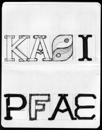
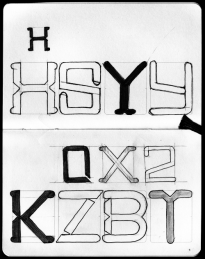
My first attempt at an original typeface design

This is still early days, but it’s starting to come together. My major reservation is that it looks a little – familiar. I’m a bit worried I may be unconsciously imitating another font I have seen. It has a certain T26 vibe.

Geronimo! Adventures in Space and Type: Part 2

Progress report for day two of the ‘Geronimo!’ Doctor Who font experiment. Most of it is basically there, but I’m pretty unhappy with some of the details. Nothing like kerning has even been attempted here, this is literally just so I can see how the whole alphabet looks.

Now I need to work on how to make the difficult characters (B, G, Q, Y, V) work, and what, if anything, I can do to improve the bland characters (E, F, S, Z).

I still plan to do numbers and some of the more essential special characters(“, &, #, ~, @, +, – and parentheses).

Geronimo! Adventures in Space and Type: Part 1

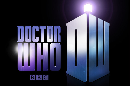
This evening I’ve been playing around in Inkskape, trying to reproduce the typeface used in the new Doctor Who logo. If I finish it, I’ll set it free on the internet for the Whovians to play with. I picked it mostly because it’s a nice simple design. I plan to call the font ‘Geronimo’.

On closer inspection, I’ve started to take a strong dislike to this new logo. I find the ‘DW’ TARDIS shape to be huge and ugly, but even the letters themselves seem to have some funny issues. Look at the third slide attached to this post, or go and find a larger version of this image on the BBC site. The H‘s right leg is thicker, and the O is not symmetrical vertically! The W is just so ugly I’m reluctant to draw it, and I have no idea why they made the R like they did.

Anyway, I’m going to be faithful to what they’ve done here, but I’ll probably build in an alternate character set with my own ‘improvements’.

Retro cassette icon freebie #Daily365

Today’s daily design is an icon of an old cassette tape. I’m making the actual SVG vector file available with this post in an attached ZIP file (I think Posterous does something sensible with those!)*. I consider it free to use for any non-profit reason.

It generally follows the principles of the Tango icons, commonly used on Linux’s Gnome desktop, but I haven’t exactly paid close attention to their guidelines.

* Note 2011.10.13: This post was written at a time when this blog was hosted on Posterous, who offered hosting for small data files like this. Leave a comment if you want a copy of this icon, and I’ll Dropbox it for you.

Password incorrect #Daily365

Conceptually this one is a bit weak, but this is a technique I’ve been wanting to try for a while. I wish I had put a bit more personality into the poses, especially the 6 who should at least be shaking his fist!

The robots already existed, but the rest of the composition and rendering took exactly an hour.

Bath time #Daily365

Today’s daily design makes use of my earlier penguin cartoon, and adds another little guy who looks like he wanted a bath. I’ve tried to reference a little of the style of old-school animations, by making it look like the background was painted on a separate layer. Sadly, the direction of light is inconsistent on these two because I drew the smaller chap facing the other way and flipped him at a later stage, when I didn’t have the time or inclination to redraw the shadows.

I know: excuses, excuses.

Welsh Twitter dragon #Daily365

A bit of a cheat today – this design wasn’t created entirely this evening. In fact, it’s about three evening’s work (see other posts from last September).

Tonight, I changed the eyebrow so he looks less angry (I actually preferred that look, but had several negative criticisms), finalised the palette using a nice scheme from Colour Lovers and added a bit of canvas texture in GIMP.

Of course, I’m not the only one doing these daily designs – check out ‘Of Science and Beauty‘ for some really nice science themed illustrations.

Blogging icons

I’ve been slightly tweaking a nice WordPress theme to use for my blog, and I wanted to use some nice minimalistic icons. I had in mind the excellent Picol project icons, but on closer inspection they were a bit mismatched and when I saw them in place they looked like they had come from several different icon sets.

So these were heavily inspired by Picol, but a little more rounded and consistent with each other. The set took less than an hour.

Droste experiment

Image

This is a finished image, but I’m not uploading it to flickr because I’m going to rework it. For starters, I’m going to remove the top foot that is poking into the spiral, and then maybe experiment with some other fun details.

The Droste illusion is fascinating, and I’m still experimenting. I’m planning to produce some real head-twisters.