A model for local leaks: localeaks.com

A while ago I was thinking how a every region should have a WikiLeaks style service so people could leak information about their local councils and government. Localeaks.com seem to have a good system set up to do just this.

localeaks.com

Using Localeaks, you can send an anonymous tip, including a file, to over 1400 newspapers in the U.S. through one online form. Choose your state. Choose the newspaper. Enter your information and submit your anonymous tip.

Each drop-box consists of a secure web connection and a form that encrypts both files and the text submitted (then destroys the originals) as well as removes identifying metadata from documents. The system also makes every effort to leave no traceable remnants from the transaction, such as identifiable session cookies on the client side or logging of any IP addresses on the server side.

via Localeaks: A Drop-Box for Anonymous Tips to 1400 U.S. Newspapers – readwriteweb.com

Advertisement

Link

This is handy. If you go to google.com/ads/preferences you can find out what Google thinks you’re interested in.

It seems to know mw pretty well, though I’m not sure why it thinks I care about Java. I’m not much interested in physics or academic conferences and papers either, but I have spent a bit of time reading through some recently.

You can remove categories you are not interested in, ad some new ones or opt out of the whole deal from this page.

Since you’ve read this, you may also find your Google account settings and your dashboard interesting or useful. The web history can be fun to trawl through too.

Continue reading

Facebook’s Registration Tool increases sign-ups by 300%

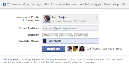
I still refuse to use Facebook, a decision that is validated every time company hits the news, but I have to admit, if I were to build a site that required registration I would be sorely tempted to use this registration tool:

Facebook has launched a new registration tool that enables websites to offer quick and easy social options for users to sign-up.

This is a terrific alternative to using Facebook Login, (formerly known as Facebook Connect) especially when 1) You would like to provide an option for those users who don’t have Facebook account, 2) Your site requires additional information not available on Facebook, or 3) You want the flexibility of HTML, molding the login to your site in any way you see fit.

It’s ideal to minimize any sort of inconvenience for the user on your website, and traditionally, a registration page has been a big turn off for users. Often times they don’t see the value. With Facebook’s registration tool, you make it easy for people to sign up and bring their friends with them, and it’s proven that people are more likely to follow through with the sign up process, will be active on sites longer, share more content, and return more often. For example, FriendFeed beta tested the tool and their sign ups by users with Facebook increased by 300%.

(via Facebook’s Registration Tool – marketaire.com)
Continue reading

Extend battery life with finger power

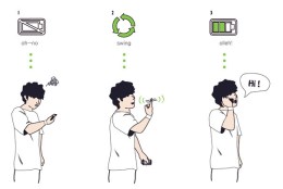
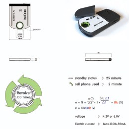
[…] a helpful solution for a tricky situation. The situation being: you running out of juice on your mobile phone. So what do you do? Remove the battery from the back of the phone; give it a few good turns around your index finger and its gathered enough power to last you a conversation or a safe trip to your charger and electric point.

(via Cheers To Finger Power! – yankodesign.com)

Clever.

Link

The Oatmeal is one of the top webcomics out there. Matthew talks about creating the site, his ideas and how he drove traffic to it. While sharing his favorite comic strips, he offers up some advice on how to create successful viral marketing campaigns.

(via How to Get 5 Million People to Read Your Website by Matthew Inman – youtube.com)

I think this mostly serves as an advert for The Oatmeal, which is very much against the spirit of Ignite. Still, there are some good tips in here.

(via @asittingduck)

Five emotions invented by the Internet

Yes, yes, yes, yes and yes. In fact, I’ve been experiencing #3 for about the last hour:

The state of being ‘installed’ at a computer or laptop for an extended period of time without purpose, characterized by a blurry, formless anxiety undercut with something hard like desperation. During this time the individual will have several windows open, generally several browser ‘tabs,’ a Microsoft Word document in some state of incompletion, the individual’s own Facebook page as well as that of another randomly-selected individual who may or may not be on the ‘friends’ list, 2-5 Gchat conversations that are no longer immediately active, possibly iTunes and a ‘client’ for Twitter. The individual will switch between the open applications/tabs in a fashion that appears organized but is functionally aimless, will return to reading some kind of ‘blog post’ in one browser tab and become distracted at the third paragraph for the third time before switching to the Gmail inbox and refreshing it again.

The behavior equates to mindlessly refreshing and ‘lozenging’ the same sources of information repeatedly. While performing this behavior the individual feels a sense of numb depersonalization, being calmly and pragmatically aware that they have no identifiable need to be at the computer nor are they gleaning any practical use from it at that moment, and the individual may feel vaguely uncomfortable or ashamed about this awareness in concert with the fact that they continue to perform the idle ‘refreshing’ behavior. They may feel increasingly anxious and needful, similar to the sensation of having an itch that needs scratching or a thirst that needs quenching, all while feeling as though they are calm or slightly bored.

(via Five Emotions Invented By The Internet – thoughtcatalog.com)

Though they’re not really new emotions, just new situations that stir up unfamiliar combinations of emotion. The other experiences are:

  • A vague and gnawing pang of anxiety centered around an IM window that has lulled.
  • A sudden and irrational rage in response to reading an ‘@-reply’ on Twitter.
  • The car collision of appetite and discomfort one feels simultaneously when using the internet to seek and consume images or information that may be considered unseemly or inappropriate. 
  • The sense of fatigue and disconnect one experiences after emitting a massive stream of content only to hit some kind of ‘wall’ and forget and/or abandon the entire thing. 

Why you should use the location field in Twitter

I have two good reasons why you should consider using the location field for its intended purpose:

  1. You’re not being as clever as you think (see below).
  2. One of the best uses of Twitter is finding out what is happening locally.

Personally, I will almost always follow someone local to me. If you’re a postman in Hull, then who cares, but if you might be my postman, then you could be really interesting to follow.

You don’t have to type out your whole address or anything. City or county is close enough to be handy.

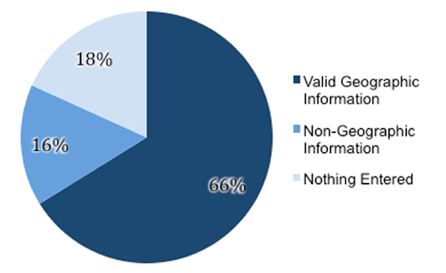
An analysis of the non-geographic information entered into the location field

via Augmented Social Cognition Research Blog from PARC: “Location” Field in Twitter User Profiles (and an interesting fact about Justin Bieber) – asc-parc.blogspot.com

Continue reading

Proof that paywalls don’t always have to drive readers away

Journalism Online says that pageviews fell between 0% and 20% and unique visits fell between just 0% and 7% (neither figure a huge disaster when you introduce a paywall), while advertising revenue didn’t fall at all for any of the titles.

It’s worth noting that the newspapers concerned didn’t block all content completely from non-paying visitors. Instead, only readers who view more than a set number of pages per month, usually between 5 and 20, have to pay.

The policy is stark contrast from the most high-profile recent paywall launches – those by Rupert Murdoch in the UK for his Times, Sunday Times and News of the World titles. In those cases, all content is completely blocked until you stump up some cash (or at least sign up for a free trial). We’re still to hear exactly how successful this policy has been. Publisher News International released some vague figures that weren’t very enlightening, while the unofficial word is that the policy didn’t start out well.

(via Proof that paywalls don’t always have to drive readers away – thenextweb.com)

Perhaps a paywall like this could work for community sites too.

If you set this meter conservatively, which we urge people to do, it’s a nonevent for 85, 90, 95 percent of the people who come to your Web site,” Mr. Brill said.

(via Journalism Online Examines Pay Model – nytimes.com)

What a brilliant name!

The only relationship Facebook really cares about: Your data and those who will pay them for it.

Facebook continues to use UX design for mild acts of evil. This is their latest ploy to take your information that was once private and expose it to the world

Yesterday, something I said on Twitter seems to have resonated. “It takes a court order to get your personal data from Twitter, but just anyone can get it from Facebook.”

Many people skim read (at best) or don’t read at all (at worst) messages about changes to terms of service like this. They just click the “I accept” or “Allow” button, trusting that an application or service has their best interests at heart. To make sure its users fully understand the implications of clicking “Allow”, Facebook should disable that button until a user confirms that they have read and understand what all this really means for them, their children and their privacy.

(via Hardly your grandmother’s Facebook New User Object fields – stuffandnonsense.co.uk)

Continue reading

Informationless graphics

A picture is worth a thousand words right? But what about a picture AND a thousand words? Whoa. You may just have an infographic on your hands.

From airline safety manuals to complex data visualizations, I have always been fascinated by infographics. A well done infographic has the power to capture one’s acute attention span and convey information that would have taken longer to simply read (oh no, not reading!). However, for every brilliantly thought out and well executed mashup of art and data, there now seems to be an influx of mundane and formulaic counterparts infesting the very internet that we hold so near and dear.

(via An Intimate Look at Infographics – thinkbrilliant.com)

The backlash against pointless infographics has begun. Let’s speed this one along…

If you type two spaces after a full stop, you’re doing it wrong. Period.

Every modern typographer agrees on the one-space rule. It’s one of the canonical rules of the profession, in the same way that waiters know that the salad fork goes to the left of the dinner fork and fashion designers know to put men’s shirt buttons on the right and women’s on the left. Every major style guide—including the Modern Language Association Style Manual and the Chicago Manual of Style—prescribes a single space after a period. (The Publications Manual of the American Psychological Association, used widely in the social sciences, allows for two spaces in draft manuscripts but recommends one space in published work.) Most ordinary people would know the one-space rule, too, if it weren’t for a quirk of history. In the middle of the last century, a now-outmoded technology—the manual typewriter—invaded the American workplace. To accommodate that machine’s shortcomings, everyone began to type wrong. And even though we no longer use typewriters, we all still type like we do. (Also see the persistence of the dreaded Caps Lock key.)

The problem with typewriters was that they used monospaced type—that is, every character occupied an equal amount of horizontal space. This bucked a long tradition of proportional typesetting, in which skinny characters (like I or 1) were given less space than fat ones (like W or M). Monospaced type gives you text that looks “loose” and uneven; there’s a lot of white space between characters and words, so it’s more difficult to spot the spaces between sentences immediately. Hence the adoption of the two-space rule—on a typewriter, an extra space after a sentence makes text easier to read. Here’s the thing, though: Monospaced fonts went out in the 1970s. First electric typewriters and then computers began to offer people ways to create text using proportional fonts. Today nearly every font on your PC is proportional. (Courier is the one major exception.) Because we’ve all switched to modern fonts, adding two spaces after a period no longer enhances readability, typographers say. It diminishes it.

(via Space Invaders – Why you should never, ever use two spaces after a period – slate.com)

Amen.

Natural Born Clickers: 50% drop in ad clickers

Heavy, Moderate, Light Display Ad Clicker Analysis
March 2009 vs. July 2007
Total U.S. – Home/Work/University Locations
Source: comScore
  Share of All Internet Users Share of Click-Throughs
Jul-07 Mar-09 Jul-07 Mar-09
Total Clickers 32% 16% 100% 100%
Heavy Clickers 6% 4% 50% 67%
Moderate Clickers 10% 4% 30% 18%
Light Clickers 16% 8% 20% 15%
Non-Clickers 68% 84% 0% 0%

[…]

“A click means nothing, earns no revenue and creates no brand equity. Your online advertising has some goal – and it’s certainly not to generate clicks,” said Starcom USA SVP/Director, Research & Analytics John Lowell. “You want people to visit your website, seek more information, purchase a product, become a lead, keep your brand top of mind, learn something new, feel differently – the list goes on. Regardless of whether the consumer clicked on an ad or not, the key is to determine how that ad unit influenced them to think, feel or do something they wouldn’t have done otherwise.”

(via comscore.com)

According to this, 8% of users are doing 85% of the clicking. Given that most email in circulation is spam, these few gullible clicker people have ruined the internet for everyone else…

So you found something cool on the internet…

So you found something cool on the internet...

Loldwell and Rosscott created this handy “So you found something cool on the Internet” comic flowchart to help encourage proper attribution of people’s work found on the Internet.

“See Something? Cite Something.” Amen brother!

Help support these awesome guys by buying one of their t-shirts or posters.

(via Comic Flowchart That Encourages Attribution of Work Found Online – laughingsquid.com)
Continue reading

Link

This slideshow requires JavaScript.

A while ago I asked if there were any good fractal generator apps for the Mac.

I’ve found Oxidizer so far, but it looks a little limited (although I haven’t actually tried it yet).

Well, I was wrong. It’s brilliant. I’m hoping to produce a series of images using it, and maybe even some animations. I’ve also installed Electric Sheep as my screensaver (multiplatform).

[Previous post]

Product placement in movies

[…] did you know the “All restaurants are Taco Bell” scene in Demolition Man was replaced with a horribly-dubbed version that said “Pizza Hut” for the European version?  Or that one of the biggest product placement whores of all time is Michael Bay?  Okay, that second one you probably already knew.

via A Brief History of Conspicuous Product Placement in Movies – filmdrunk.uproxx.com

Wilson

Product placement has a place in movies and television. I’d rather see Michael J. Fox slurping from a Pepsi than have the narrative broken for a few minutes for a commercial break.

Sadly you tend to get both. We’re going to be seeing much more placement in the future too, as advertisers want to be able to market to those who torrent or TiVo their television shows.

Continue reading