
Recently I’ve been taking advantage of the WordPress.com custom design upgrade to pimp my theme, so I thought I would share some of the CSS I have written. Twenty Eleven is the second most popular theme in the WP.com directory, so why not make yours stand out too?
I’m a big fan of Twenty Eleven, however it is starting to show its age. It’s funny how these designs date so quickly. Twenty Ten looked positively cutting edge compared to Kubrick (which was itself a very modern theme back in 2006!). I have been tempted to update to the newer Twenty Twelve, but feel that I have invested too much time and effort into getting the look and feel of my blog just right. Instead I’m pulling some of the future back into the past.
Using these snippets
 I’ve written all these enhancements in such a way that your blog won’t look strange if and when you decide to stop paying for the custom CSS feature. There are no drastic changes here, just some cosmetic alterations.
While this CSS was written specifically to build upon the Twenty Eleven theme, many of the snippets are general enough to be applicable to pretty much any WordPress theme (or any other CMS with a little modification).
To get started from your dashboard navigate to Appearance → Custom Design, then click on the CSS tab. Paste anything you like the sound of in there, then hit save. If you have any questions, leave a comment below or ask in the WP.com CSS customisation forum.
WordPress.org users will be able to add this code directly into their theme’s style.css file. Alternatively you can install the excellent Jetpack plugin and take advantage of its custom CSS feature in your dashboard.
Making a nice #page border
The first alteration I made was to remove the border at the top of the page – a design touch that had always irked me.
#branding {
	border-top: 0 transparent none!important;
}
For a while that was the only change I made, but eventually I decided I wanted to make some more substantial changes. After some experimentation I came up with a white border, rounded corners and drop shadow. The look is quite different from the default, but nothing radical.

A screenshot of halfblog.net as it currently looks, for future reference.
Here’s the CSS:
#page {
	border: 5px solid #fff;
	-webkit-border-radius: 5px;
	-moz-border-radius: 5px;
	border-radius: 5px;
	-webkit-box-shadow: 0 2px 10px 1px rgba(0,0,0,0.4);
	-moz-box-shadow: 0 2px 10px 1px rgba(0,0,0,0.4);
	box-shadow: 0 2px 10px 1px rgba(0,0,0,0.4);
}

#branding img {
	-webkit-border-radius: 3px 3px 0 0;
	-moz-border-radius: 3px 3px 0 0;
	border-radius: 3px 3px 0 0;
}

#access {
	-moz-border-radius: 0 0 3px 3px;
	-webkit-border-radius: 0 0 3px 3px;
	border-radius: 0 0 3px 3px;
}
The #branding img and #access declarations add rounded corners to the top of the header images and the bottom of the navigation bar.
Open Sans and other typographical tweaks
One of the positive trends on the web in recent years has been the move towards larger font sizes. The preferred minimum these days is around 16px. Were I designing a site from scratch I may have chosen an even larger size, but that wouldn’t work so well with this theme.
body {
	font-size: 16px;
	font-family: "Open Sans", "Helvetica Neue", Helvetica, Arial, sans-serif;
}
By default Twenty Eleven specifies Helvetica Neue, which I really like, but Twenty Twelve uses the new Open Sans, which I think looks even better. WordPress.com have adopted Open Sans as their default typeface, but I was disappointed not to find it in their custom design package as an option for my blog. I could always sign up for Typekit and use the font that way, but it requires and Adobe account and I haven’t quite been bothered. Then, to my surprise, I discovered that a Google Web Fonts copy of Open Sans was linked to, presumably to style any WP.com elements that may appear on my pages. I didn’t need to be told twice so I specified it straight away, with Helvetica Neue as a fallback.
Big headers, no comment
As well as upping the body font size, I bumped the main header size up from a decent 26px to an extra-decent 46px. To make room for this increase I removed the comment count bubble that is usually aligned to the right of the header. The padding-right: 0; ensures that the header takes up the unused space.
h1.entry-title, h2.entry-title, .singular .entry-title {
	font-size: 46px;
	font-weight: normal;
	line-height: 1em;
	color: #333;
	padding-right: 0;
}

h1.entry-title a {
	color: #333;
	-webkit-transition: color 4s ease;
	-moz-transition: color 4s ease;
	-o-transition: color 4s ease;
	transition: color 4s ease;
}

h1.entry-title a:hover {
	color: #06c;
	-webkit-transition: color .1s ease-in;
	-moz-transition: color .1s ease-in;
	-o-transition: color .1s ease-in;
	transition: color .1s ease-in;
}

header .comments-link {
	display: none;
}
I’ve also used some CSS animation of the header links so that on :hover they turn blue, and when the cursor is removed they slowly fade back to black. (Well, back to #333, but that doesn’t have quite the same ring!)
Other headers
I’ve also bumped up the size of h2 and h3 headers. In particular I always found the h3‘s a little thin in the posts, though I like them as headers in the sidebars.
h2 {
	font-size: 21px;
}

.entry-content h3 {
	text-transform: none;
	font-weight: bold;
	font-size: 18px;
	letter-spacing: 0;
}
The lede
In the jargon of journalism the lede (or lead) is the opening paragraph of an article. It typically sums up the maid idea of the story that follows. Once the CSS has been added, you’ll need to specify it in the markup of your post by adding the class to the opening paragraph (or a span) like so: <p class="lede"> … </p>
.singular .lede {
	margin: 0 -11.125% 1.625em;
	font-size: 21px;
	line-height: 1.6125em;
	color: #222;
	letter-spacing: .05em;
}

.lede:first-line {
	color: #111;
	font-weight: 900;
}

@media (max-width: 800px) {
	.singular .lede {
		margin: 0 0 1.625em;
		font-size: 18px;
	}
}
Like with the .pull class that can be added to blockquotes, the lede will break out of the margins. This CSS uses a media query to pop the text back into the margins at screen sizes under 800px.
Blockquotes
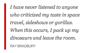 I use blockquotes a lot on this blog, so I wanted a style that stood out more.
The regular blockquotes are tighter to the margins, with a coloured stripe down the left side – a style I’ve always rather fancied.
The bigger .pull blockquotes are more stylised as I use these quite often to bring colour to an otherwise fairly plain post.
blockquote {
	color: #333;
	margin: 0 0 .625em -1.2em;
	border-left: .4em solid #c00;
	padding-left: .8em;
}

blockquote.pull {
	font-style: italic;
	border-left: 0 none transparent;
	color: #cc0000;
}
‘Read more →’ links
These ‘Read more’ links appear when you create a break point in your posts where the user will have to click if they want to read the rest of the article. I have styled mine so they stand out a bit more as I do this quite often.
a.more-link, a.more-link:visited {
	font-weight: bold;
	color: #cc0000;
	white-space: nowrap;
}

a.more-link:hover, a.more-link:active {
	color: #de1111;
	text-decoration: none;
}
Further reading: A fun WordPress trick: Customise your ‘Read more…’ text
Cloudy, with a chance of tags
This simple cosmetic touch centres the tag and category clouds when they appear in the footer.
footer .widget_tag_cloud, footer .wp_widget_tag_cloud {
	text-align: center;
}
And that brings me to the foot of the the page and the end of my theme tweaks.
The custom design upgrade
In my opinion, the WordPress.com custom design upgrade is brilliant. WP.org users may scoff at the limitations, but regular users who simply want to add some personality to their blog will be much better served by the tools that make it easy to create very nice looking and unique blog designs. For $30 per year it may not be as cheap as you would like (especially when combined with the cost of the other upgrades) but it’s worth it if you want your blog to stand out.

Radically overhaul your blog with smart colour palettes, complementary background images and complete control without touching a line of CSS.
In addition users can choose from a wide range of Typekit web fonts.

Again, this feature is nicely designed to help prevent design noobs from going all MySpace on their blogs.
And, of course, access to a rather nice CSS editor that will append styles to your theme (or completely replace your theme’s CSS if you prefer).


Pingback: My thanks to everyone whom has read the blog so far… | Rob's blog