
If I’ve not been blogging or tweeting much recently, it’s because I’ve discovered Minecraft!
If I’ve not been blogging or tweeting much recently, it’s because I’ve discovered Minecraft!
Back in 1994, Italian novelist Umberto Eco (writer of “Foucault’s Pendulum” and “The Name of The Rose”) published a now-legendary, whimsical piece in the Italian news weekly Espresso, contending that the Microsoft/Apple rivalry is “a religious war.” Eco was “firmly of the opinion” that the Macintosh is Catholic; “It is cheerful, friendly, conciliatory, it tells the faithful how they must proceed step by step to reach — if not the kingdom of heaven — the moment in which their document is printed.” He pointed out that with a Mac you deal with simple formulae and sumptuous icons, and “everyone has a right to salvation.”
On the other hand, Eco contended, the (then mostly DOS-based) PC was Protestant, “or even Calvinistic,” demanding difficult decisions and interpretations, taking “for granted the idea that not all can reach salvation.” The PC user “is closed within the loneliness of his own inner torment.”
Is Apple a Cult, a Religion or a Brand? – theappleblog.com
 My computer history, briefly, has been Acorn Electron, Amiga 500, various PCs running Windows 95, then ME and finally XP, which brings me to the machines I use now. I have an Eee-PC netbook (which for a year was my only personal computer). I experimented with a few Linux distros and eventually settled on CrunchBang Linux.
I also bought an iPhone 3G in this period, which eventually helped me decide to buy a 27″ iMac, which I think is absolutely fantastic. Continue reading
This trailer is well done (if a bit overlong) but the theory behind it is amazing.
My favorite thought-piece about Ferris Bueller is the “Fight Club” theory, in which Ferris Bueller, the person, is just a figment of Cameron’s imagination, like Tyler Durden, and Sloane is the girl Cameron secretly loves.
One day while he’s lying sick in bed, Cameron lets “Ferris” steal his father’s car and take the day off, and as Cameron wanders around the city, all of his interactions with Ferris and Sloane, and all the impossible hijinks, are all just played out in his head. This is part of the reason why the “three” characters can see so much of Chicago in less than one day — Cameron is alone, just imagining it all.
It isn’t until he destroys the front of the car in a fugue state does he finally get a grip and decide to confront his father, after which he imagines a final, impossible escape for Ferris and a storybook happy ending for Sloane (“He’s gonna marry me!”), the girl that Cameron knows he can never have.
(via Cool Papa Bell / metatalk.metafilter.com)
I don’t think for a second that Ferris Bueller was written with this complicated extra dimension in mind, but I’m curious to watch the film again and see if it holds water retrospectively!
“Weeping Angel” problem – an issue in a project (or similar) which is under control while someone is actively watching it but will go badly wrong the moment that no-one is observing/managing.
This great example of project management speak just got emailed around work, via Yammer:
Another late night progress report for ‘my’ Doctor Who font. Mostly subtle tweaks, but these usually take the longest. There’s still a lot I’m not keen on, in Particular the V. Both Y‘s are ugly, but I’m fairly happy with the current G and Q situation.

I’m open to constructive criticisms and suggestions at this point.
![]()
Progress report for day two of the ‘Geronimo!’ Doctor Who font experiment. Most of it is basically there, but I’m pretty unhappy with some of the details. Nothing like kerning has even been attempted here, this is literally just so I can see how the whole alphabet looks.

Now I need to work on how to make the difficult characters (B, G, Q, Y, V) work, and what, if anything, I can do to improve the bland characters (E, F, S, Z).
I still plan to do numbers and some of the more essential special characters(“, &, #, ~, @, +, – and parentheses).


This evening I’ve been playing around in Inkskape, trying to reproduce the typeface used in the new Doctor Who logo. If I finish it, I’ll set it free on the internet for the Whovians to play with. I picked it mostly because it’s a nice simple design. I plan to call the font ‘Geronimo’.
![]()
On closer inspection, I’ve started to take a strong dislike to this new logo. I find the ‘DW’ TARDIS shape to be huge and ugly, but even the letters themselves seem to have some funny issues. Look at the third slide attached to this post, or go and find a larger version of this image on the BBC site. The H‘s right leg is thicker, and the O is not symmetrical vertically! The W is just so ugly I’m reluctant to draw it, and I have no idea why they made the R like they did.
Anyway, I’m going to be faithful to what they’ve done here, but I’ll probably build in an alternate character set with my own ‘improvements’.
I had almost forgotten to finish uploading my behind the scenes pictures from my time on the Dr Who and Torchwood sets! The big cog-wheel-door (which always reminded me of Deep Space Nine) is as convincing as the rest of the set, until you thump it and hear the dull thud of plywood.
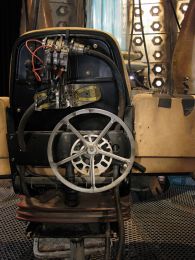
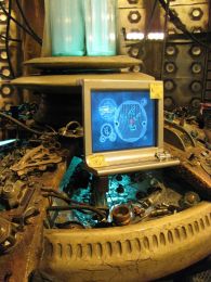
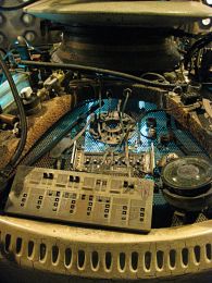
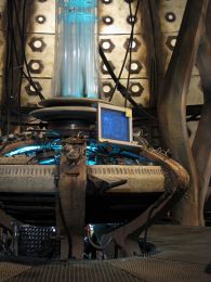
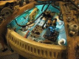
The last of my pictures of the TARDIS set are all closeup details of the centre console. You can really see how cobbled together it is from common and garden parts.
So, if Torchwood is such a super-secret, literally underground operation, then why do they brand everything? There is not a detail on the set that doesn’t have a logo – old or new – stuck to it somewhere. Even the drinking fountain!
The ‘subway’ used to link the different Torchwoods together (Besides Cardiff, there is the one in London that featured in Doomsday, one in Glasgow, and apparently one that went missing). The network fell into disuse, so now it’s where they have pizza and beer. As realistic as all these tiles are, when you touch them you can tell that they’re painted wood and paper.
The Welsh dragon on the wall is a nice touch. Apparently Tosh was painting it there, but that backstory never featured in an episode. I guess it never will now.
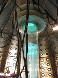
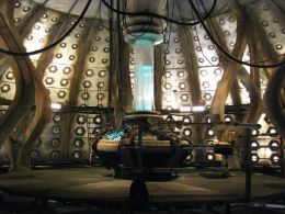
As you can see, in reality the TARDIS is exactly as big on the inside as it is on the outside!
Some more pictures of the Torchwood set. Check out the coral on Jack's desk – apparently he’s trying to grow a TARDIS! The old style television sets appeared in the Dr Who episode, The Idiot’s Lantern. To the left, on the floor, you can see the hatch to Jack’s ‘bedroom’, where Chris Moyles got stuck. There is a copy of Little Dorrit on the desk, in reference to the BBC show, starring Eve Myles.
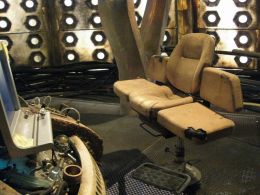
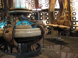
Welcome aboard the Tardis. The ‘coral’ supports are literally paper mache, and very fragile. In contrast to the Torchwood set, the level of detail is much less, as some of these shots reveal.
A selection of photos from the fantastic Torchwood set. This impressive 360º set was detailed for HD, so everything is highly realistic – until you touch it! Check out the slides up on the big lightbox wall. The dead body on the slab is a corpse from ‘The Lazarus Experiment‘.

Here is just a little sneak peek at some of the photo’s I took today, on the amazing Torchwood Hub set and, of course, the Tardis! I have many other pics I’m working through so expect more over the next few days. I need to relax a little now though…


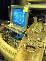
Sadly this shot didn’t come out the clearest, but I spotted today that one of the computers on the Torchwood Hub set was running Ubuntu. It had VLC running, so I’m assuming that they use free software to play all the graphics that give you the illusion of a super-advanced OS.
