iA’s Cosmic 140 poster – just an infogimmick?


(via informationarchitects.jp)

Apart from helping you identify the really big users, this graphic tells you absolutely nothing at a glance. It’s not even useful to identify Twitter’s most followed user – you have to glance around a bit and decode the numbers to figure that out.

And the categories are far from useful: Michael Jordan is halfway between music and sport, while Conan O’Brien is under entertainment, but has no crossover into humour at all. Bill Gates and Eric Schmidt are classified under technology, near art and design but miles away from business.

Pure gimmickry, and not even that appealing visually. Or am I missing the point?

Link

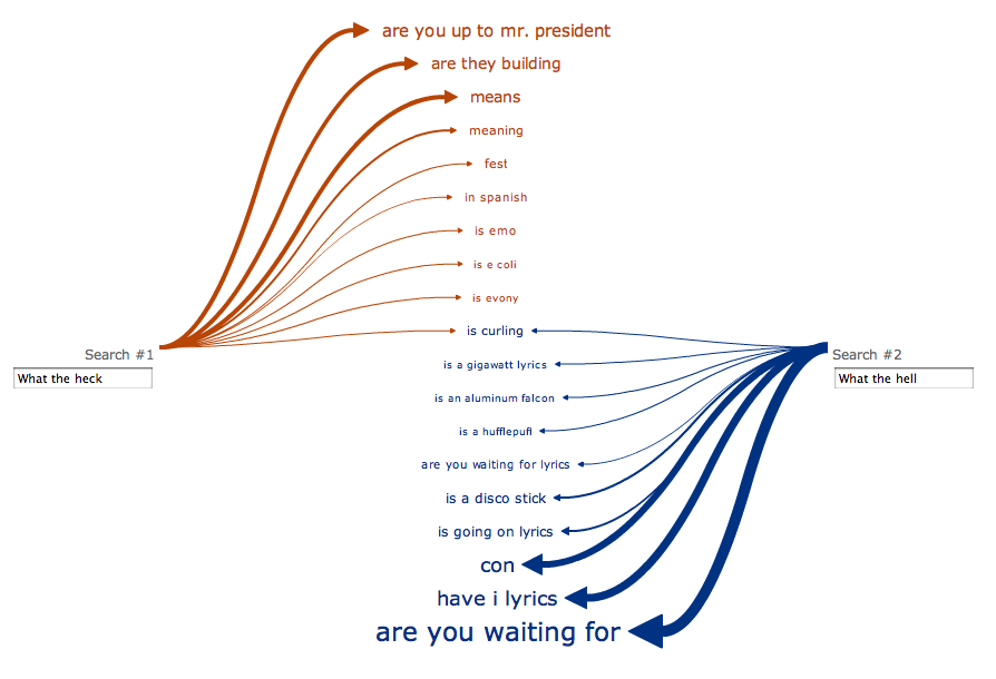
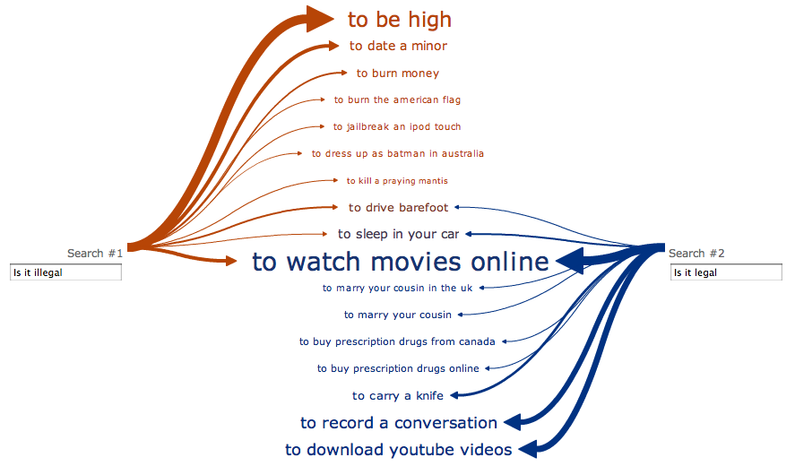
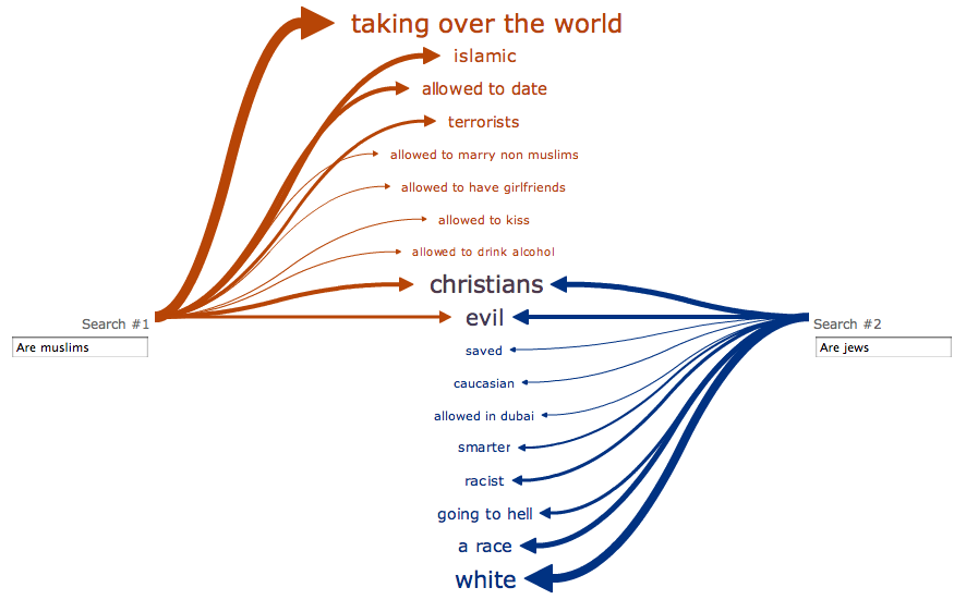
Web Seer is a fascinating tool that lets you explore what questions people are typing into Google, and compare it to other questions to see where they overlap. Admittedly, I can’t think of a real world use for this, but it’s fun to play with. If you find an interesting comparison, please leave a link in the comments!

More info on the Web Seer project page.

Continue reading

#0044CC – The one hundred million dollar colour

Microsoft also tested multiple versions of blue for links in their search results. A specific color of blue (#0044CC) drove $80-$100 million dollars a year increase over the light blue the design team tried first.

(via lukew.com & found via Andrew Parker)

Andrew references Douglas Bowman in his post, who quit Google’s design team, citing an example of the time the company did extensive testing to pick from 41 shades of blue. It seems that perhaps Google have it right.

Handy Cardiff Bus live departures map

Cardiff Bus live departures map

Fellow Cardiff public transport users – you have my sympathies! Hopefully, the following post will mitigate your suffering.

Cardiff County Council provide a handy Google map that displays Cardiff bus departure information in real time:

From this site you can locate real-time bus departure information quickly and easily.

No more waiting around for late buses; by using GPS technology to monitor the movement of our vehicles, we can accurately predict the arrival of buses at our stops for several hours into the future.

Its cold, you should not be waiting for a bus for more than five minutes. We can help!

When you click on any of the stops, you will see a list of the next departures. What’s even more useful is you can detatch the little lists into separate windows and bookmark them, so you can keep an eye on your next bus home without having to load the map and find your stop every time. I have a few key pages bookmarked on my iPhone, which works nicely enough. A proper mobile version of this site would be extra useful.

The homepage gives you options to search by service number, stop number and postcode, so you can get the information without using the map. It’s all rather helpful and nicely done.

I notice Cardiff Bus don’t seem to link to the service, which is a shame.

My bad. Cardiff Bus do have a good links page, that I really should have seen. Thanks to the commenter below, who also points out that the map is not just for Cardiff Bus services.

cardiff.acislive.com

[Updated 11th March 2010]

8-bit New York

8-bit New York

8-Bit NYC is an attempt to make the city feel foreign yet familiar, smashing together two culturally common models of space: the lo-fi overhead world maps of 1980s role-playing and adventure games, and the geographically accurate data that drives today’s web maps and GPS navigation. I hope to evoke the same urge for exploration, abstract sense of scale, and perhaps most importantly unbounded excitement that many of us remember experiencing on the Nintendo Entertainment System, the Commodore 64, or any other number of 8-bit microcomputers. Maps offer us visual architectures of the world, encouraging us to think about and interact with space in particularly constrained ways. Take some time to think about New York a little differently. Set out on a quest. Be an adventurer.

8bitnyc.com

Continue reading

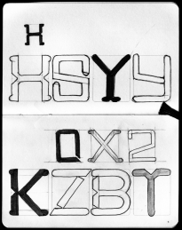
My first attempt at an original typeface design

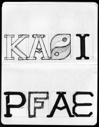
This is still early days, but it’s starting to come together. My major reservation is that it looks a little – familiar. I’m a bit worried I may be unconsciously imitating another font I have seen. It has a certain T26 vibe.

Geronimo! Adventures in Space and Type: Part 2

Progress report for day two of the ‘Geronimo!’ Doctor Who font experiment. Most of it is basically there, but I’m pretty unhappy with some of the details. Nothing like kerning has even been attempted here, this is literally just so I can see how the whole alphabet looks.

Now I need to work on how to make the difficult characters (B, G, Q, Y, V) work, and what, if anything, I can do to improve the bland characters (E, F, S, Z).

I still plan to do numbers and some of the more essential special characters(“, &, #, ~, @, +, – and parentheses).

Geronimo! Adventures in Space and Type: Part 1

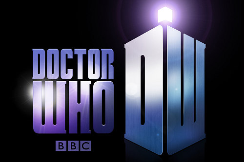
This evening I’ve been playing around in Inkskape, trying to reproduce the typeface used in the new Doctor Who logo. If I finish it, I’ll set it free on the internet for the Whovians to play with. I picked it mostly because it’s a nice simple design. I plan to call the font ‘Geronimo’.

On closer inspection, I’ve started to take a strong dislike to this new logo. I find the ‘DW’ TARDIS shape to be huge and ugly, but even the letters themselves seem to have some funny issues. Look at the third slide attached to this post, or go and find a larger version of this image on the BBC site. The H‘s right leg is thicker, and the O is not symmetrical vertically! The W is just so ugly I’m reluctant to draw it, and I have no idea why they made the R like they did.

Anyway, I’m going to be faithful to what they’ve done here, but I’ll probably build in an alternate character set with my own ‘improvements’.

Link

:—

Citing usage from 1949, the OED calls this mark the dog’s bollocks, which it defines as, “typogr. a colon followed by a dash, regarded as forming a shape resembling the male sexual organs.” This is why I love scrounging around the linguistic scrap heap that is the OED. I always come across a little gold. And by “gold,” I mean, “vulgar, 60-year-old emoticons.”

(via The Secret History of Typography in the Oxford English Dictionary – bygonebureau.com)

A great article for budding archetypists and palaeotypographists!

Retro cassette icon freebie #Daily365

Today’s daily design is an icon of an old cassette tape. I’m making the actual SVG vector file available with this post in an attached ZIP file (I think Posterous does something sensible with those!)*. I consider it free to use for any non-profit reason.

It generally follows the principles of the Tango icons, commonly used on Linux’s Gnome desktop, but I haven’t exactly paid close attention to their guidelines.

* Note 2011.10.13: This post was written at a time when this blog was hosted on Posterous, who offered hosting for small data files like this. Leave a comment if you want a copy of this icon, and I’ll Dropbox it for you.

Password incorrect #Daily365

Conceptually this one is a bit weak, but this is a technique I’ve been wanting to try for a while. I wish I had put a bit more personality into the poses, especially the 6 who should at least be shaking his fist!

The robots already existed, but the rest of the composition and rendering took exactly an hour.

Bath time #Daily365

Today’s daily design makes use of my earlier penguin cartoon, and adds another little guy who looks like he wanted a bath. I’ve tried to reference a little of the style of old-school animations, by making it look like the background was painted on a separate layer. Sadly, the direction of light is inconsistent on these two because I drew the smaller chap facing the other way and flipped him at a later stage, when I didn’t have the time or inclination to redraw the shadows.

I know: excuses, excuses.

Welsh Twitter dragon #Daily365

A bit of a cheat today – this design wasn’t created entirely this evening. In fact, it’s about three evening’s work (see other posts from last September).

Tonight, I changed the eyebrow so he looks less angry (I actually preferred that look, but had several negative criticisms), finalised the palette using a nice scheme from Colour Lovers and added a bit of canvas texture in GIMP.

Of course, I’m not the only one doing these daily designs – check out ‘Of Science and Beauty‘ for some really nice science themed illustrations.