

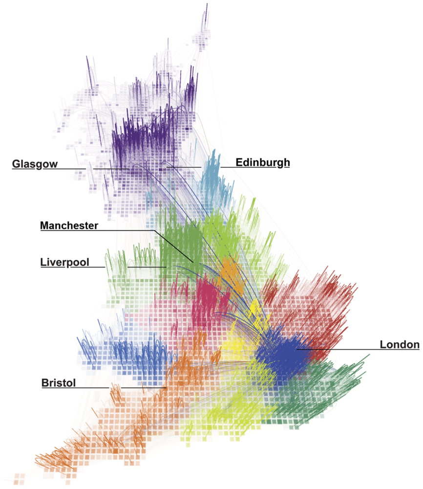
This figure shows the strongest 80% of links, as measured by total talk time, between areas within Britain. The opacity of each link is proportional to the total call time between two areas and the different colours represent regions identified using network modularity optimisation analysis.
(via Redrawing the Map of Great Britain from a Network of Human Interactions)
