
This is still early days, but it’s starting to come together. My major reservation is that it looks a little – familiar. I’m a bit worried I may be unconsciously imitating another font I have seen. It has a certain T26 vibe.

This is still early days, but it’s starting to come together. My major reservation is that it looks a little – familiar. I’m a bit worried I may be unconsciously imitating another font I have seen. It has a certain T26 vibe.
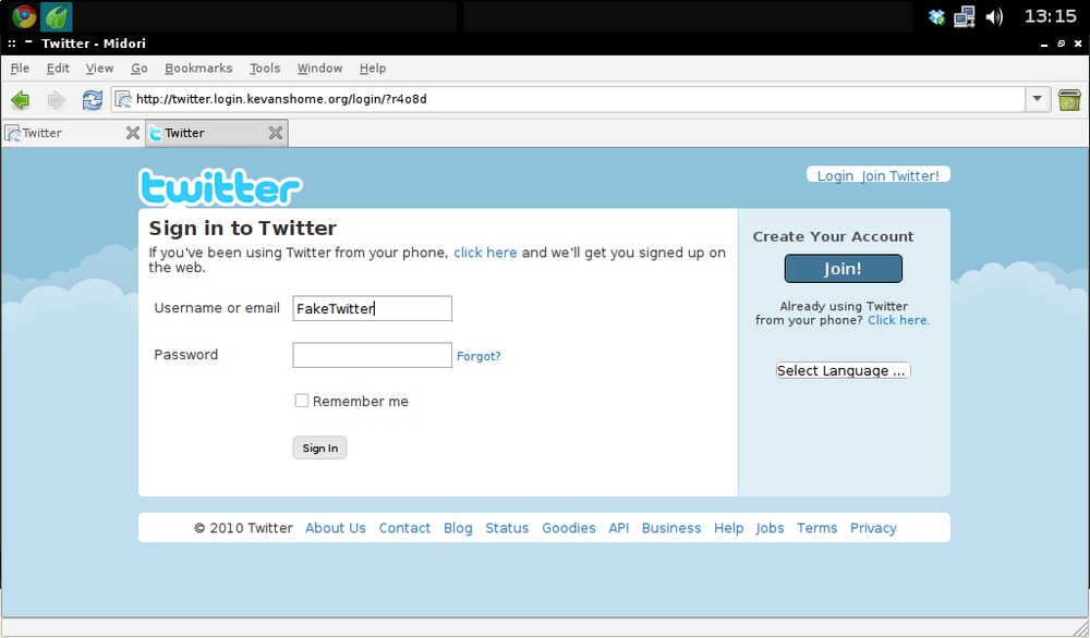
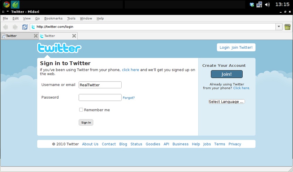
I’ve only had two of these phishing DMs that are currently all the rage on Twitter. Curiosity got the better of me, so I followed the link. I’m tempted to create a dummy account and give it the credentials to see what it does.
I’ve attached screenshots, comparing the fake login page with the real one, and the destination you get to when you give the fake page your credentials. (I used fake info, naturally!) It’s just an empty Blogger blog. Most of the other links on the fake page don’t work.
Honestly, I can see how people are taken in. I instantly noticed the padding errors where they hadn’t duplicated the page properly, but Twitter hasn’t always had the best design, so I could easily believe it was the real login page on a bad day. Of course, the URL is totally wrong, but that could be missed by people with no reason to doubt the link.
A widely deployed system intended to reduce on-line payment card fraud is fraught with security problems, according to University of Cambridge researchers.
The system is called 3-D Secure (3DS) but known better under the names Verified by Visa and MasterCard SecureCode. Implemented and paid for by e-commerce vendors, the systems require a person to enter a password or portions of a password to complete an on-line purchase.
As a reward for investing in the systems, merchants are less liable for fraudulent transactions and are stuck with fewer chargebacks. But banks such as the Royal Bank of Scotland are now holding consumers to a higher level of liability if fraudulent transactions occur using either system, said Steven J. Murdoch, a security researcher at the University of Cambridge.
I’ve been aware of the security issues with Verified by Visa for a while now, but it’s becoming increasingly difficult to avoid using the scheme. Right now I’m having to decide if it’s worth compromising my security for a cool pair of trainers. Previously, I’ve been able to use PayPal, or some other alternative, but Adidas offer VbV or nothing.
If you shop online often, read up on this a little. here’s a link to the actual paper, which is quite short and readable.
Veri ed by Visa and MasterCard SecureCode: or, How Not to Design Authentication [PDF 164KB]
 It’s clear from the pie chart that 3ds Max is the giant in the market here, with Maya (also an Autodesk product) the next big player. If you scroll down the article, what really stands out is that both of these packages consistently rank the lowest in user satisfaction.
I was surprised to see that Lightwave has such a small share. I’ve always had a soft spot for it, but perhaps in recent years the situation has changed. I stopped doing 3D work around the same time that Modo came out, and I was aware that many were switching loyalties then.
The Cinema and Houdini get big positives, but I’m especially pleased to see the open-source Blender rank so highly in most responses. I’m hoping to get back into CG graphics soon, and I’d love to invest my energies in free software.
(via cgenie.com)
Pictures taken today at Oxford’s Museum of the History of Science. They’ve been running a special Steampunk exhibition, which is on for another week. See previous posts tagged steampunk for more info.
Banners, logos, carefully crafted wordsmithery – this is all filler, we’ve found out. Users have been calloused by 15 or so years of surfing through bad ads and marketing babble, and they are unconsciously tuning out everything but the one thing they came to find.
For example, none of the 200 or so confused Facebook users who commented on our earlier post read the post itself, the huge logo at the top of the page, the many links to non-Facebook-related content or the huge, all-bold paragraph about how ReadWriteWeb is not, in fact, some ill-conceived redesign of Facebook. They simply searched for “Facebook login” and, upon navigating to our site, scrolled until they found the one button they wanted to click. Which brings us to our third assertion.
(via readwriteweb.com)
RRW has a post up about the confusion that was caused recently when one of their stories became a top Google result for ‘Facebook login’, and hundreds of confused Facebookers mistook the blog for a new Facebook design.
Some important lessons here.
More emotional stories were more likely to be e-mailed, the researchers found, and positive articles were shared more than negative ones. Longer articles generally did better than shorter articles, although Dr. Berger said that might just be because the longer articles were about more engaging topics.
[…]
Building on prior research, the Penn researchers defined the quality as an “emotion of self-transcendence, a feeling of admiration and elevation in the face of something greater than the self.”
They used two criteria for an awe-inspiring story: Its scale is large, and it requires “mental accommodation” by forcing the reader to view the world in a different way.
“It involves the opening and broadening of the mind,” write Dr. Berger and Dr. Milkman, who is a behavioral economist at Wharton.
(via nytimes.com)
It sounds like a really interesting study. I’ve had a notion for some years now to start a blog on ‘futurology’ or something similar. Now I’m wondering if that could be a hit…
Another late night progress report for ‘my’ Doctor Who font. Mostly subtle tweaks, but these usually take the longest. There’s still a lot I’m not keen on, in Particular the V. Both Y‘s are ugly, but I’m fairly happy with the current G and Q situation.

I’m open to constructive criticisms and suggestions at this point.
![]()
The promo image for Lost’s final season shows the cast sat around a plane wing in the style of The Last Supper. Battlestar Galactica did exactly the same thing for its ultimate season, and fans analysed the picture looking for clues. I’m sure the same will happen here. This scene is oft parodied.

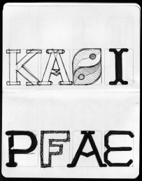
Progress report for day two of the ‘Geronimo!’ Doctor Who font experiment. Most of it is basically there, but I’m pretty unhappy with some of the details. Nothing like kerning has even been attempted here, this is literally just so I can see how the whole alphabet looks.

Now I need to work on how to make the difficult characters (B, G, Q, Y, V) work, and what, if anything, I can do to improve the bland characters (E, F, S, Z).
I still plan to do numbers and some of the more essential special characters(“, &, #, ~, @, +, – and parentheses).

I just got my first look at SeeSaw, a new online TV service (using the defunct Project Kangaroo's assets). It's iPlayer basically, with a selection of UK shows, including many non-BBC. They seem to have a good selection, including some classic Doctor Who, which should keep me entertained for a while!


This evening I’ve been playing around in Inkskape, trying to reproduce the typeface used in the new Doctor Who logo. If I finish it, I’ll set it free on the internet for the Whovians to play with. I picked it mostly because it’s a nice simple design. I plan to call the font ‘Geronimo’.
![]()
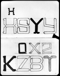
On closer inspection, I’ve started to take a strong dislike to this new logo. I find the ‘DW’ TARDIS shape to be huge and ugly, but even the letters themselves seem to have some funny issues. Look at the third slide attached to this post, or go and find a larger version of this image on the BBC site. The H‘s right leg is thicker, and the O is not symmetrical vertically! The W is just so ugly I’m reluctant to draw it, and I have no idea why they made the R like they did.
Anyway, I’m going to be faithful to what they’ve done here, but I’ll probably build in an alternate character set with my own ‘improvements’.
