So you found something cool on the internet…

So you found something cool on the internet...

Loldwell and Rosscott created this handy “So you found something cool on the Internet” comic flowchart to help encourage proper attribution of people’s work found on the Internet.

“See Something? Cite Something.” Amen brother!

Help support these awesome guys by buying one of their t-shirts or posters.

(via Comic Flowchart That Encourages Attribution of Work Found Online – laughingsquid.com)
Continue reading

Link

This slideshow requires JavaScript.

A while ago I asked if there were any good fractal generator apps for the Mac.

I’ve found Oxidizer so far, but it looks a little limited (although I haven’t actually tried it yet).

Well, I was wrong. It’s brilliant. I’m hoping to produce a series of images using it, and maybe even some animations. I’ve also installed Electric Sheep as my screensaver (multiplatform).

[Previous post]

Casio Tryx / Fujifilm FinePix X100

This is a novel form factor for a point-and-shoot. If anyone gets serious about making an open source camera, they should definitely try something inventive like this.

The design of the “variable frame” allows it to act as a sort of tripod, giving you steadier shots for video or low-light exposure and giving you one less thing to carry. Another odd feature is that the lens is not a zoom, but instead a fixed wide-angle.

(via Casio goes innovative with Tryx camera desig – core77.com)

I’m not really sure the benefits are worth the hassle though. The thing is almost like a puzzle!

Engaget has some specs.

The 12.1 megapixel shooter sports what the company’s calling Exilim Engine HS, which equates to 1080p 30 frames per second video, up to 240fps (at 432 x 320 resolution) slow-motion, and various HDR and panorama options. there’s also a 3-inch touchscreen LCD, but the biggest draw here is the swiveling enclosure that serves as a stand for setting up just the right shot. We got an early glimpse at a non-functional prototype, and the size is definitely interesting — we still need to see it in action, though. Price is a penny shy of $250 and shipping date’s April 2011.

(via Casio’s Tryx pocket camera takes a stand (literally) alongside new Exilim lineup – engadget.com)
Continue reading

Link

These animations by the RSA are wonderful. I haven’t seen them all yet, but these two were also very interesting:

  • Smile or Die: Acclaimed journalist, author and political activist Barbara Ehrenreich explores the darker side of positive thinking.
  • Drive: The surprising truth about what motivates us.

What your apps know about you

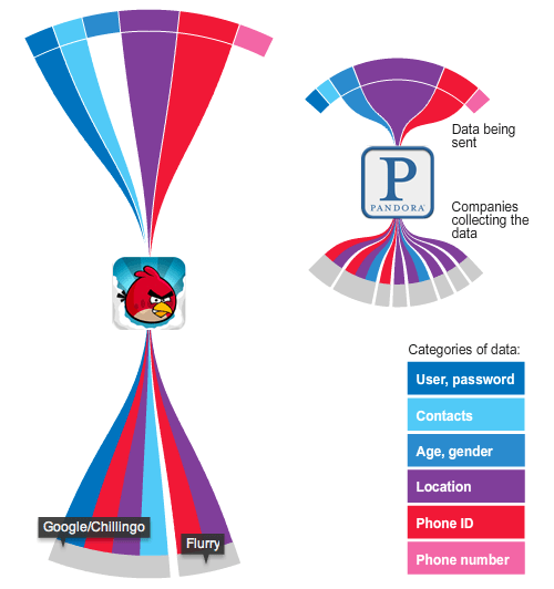
This diagram is one of many interactive infographics from the Wall Street Journal, illustrating how many apps are accessing more of your personal data than you may realise.

An examination of 101 popular smartphone “apps”—games and other software applications for iPhone and Android phones—showed that 56 transmitted the phone’s unique device ID to other companies without users’ awareness or consent. Forty-seven apps transmitted the phone’s location in some way. Five sent age, gender and other personal details to outsiders.

The findings reveal the intrusive effort by online-tracking companies to gather personal data about people in order to flesh out detailed dossiers on them.

via Your Apps Are Watching You – online.wsj.com
Continue reading

Fun with the Google Ngram Viewer

A few days ago Google launched the Google Books Ngram Viewer, a labs project that lets you compare the frequency of word use in published works, and compare these terms over time. For example, the following is a variety of common first names appearing in the English database over the last two hundred years.

Common English first names

You can see that around 1960, the name David suddenly started to gain in popularity. You can narrow the English corpus to American English, British English and English fiction, and also search works in other languages.

Continue reading

Visualizing data is like photography

Visualizing data is like photography. Instead of starting with a blank canvas, you manipulate the lens used to present the data from a certain angle.

[…] After a few minutes of rendering, the new plot appeared, and I was a bit taken aback by what I saw. The blob had turned into a surprisingly detailed map of the world. Not only were continents visible, certain international borders were apparent as well. What really struck me, though, was knowing that the lines didn’t represent coasts or rivers or political borders, but real human relationships. Each line might represent a friendship made while travelling, a family member abroad, or an old college friend pulled away by the various forces of life.

(via Visualizing Friendships – facebook.com)

It would be interesting to see if this data could show communities like the PLoS One map of Great Britain. As it stands, it’s very pretty, but I can’t see much more than areas of high Facebook use…

(via Flowing Data)

Redrawing the map of Great Britain from a network of human interactions

In other words, these maps show how the borders of countries and counties could be redrawn if they were to reflect communities rather than governmental regions.

The geography of talk in Great Britain

The geography of talk in Great Britain. This figure shows the strongest 80% of links, as measured by total talk time, between areas within Britain. The opacity of each link is proportional to the total call time between two areas and the different colours represent regions identified using network modularity optimisation analysis.

The core regions of Britain

The core regions of Britain. By combining the output from several modularity optimization methods we obtain the results shown in this figure. The thick black boundary lines show the official Government Office Regions partitioning together with Scotland and Wales. The black background spots show Britain’s towns and cities, some of which are highlighted with a label.

via Redrawing the Map of Great Britain from a Network of Human Interactions – plosone.org (CC BY 2.5)

Continue reading

Google Zeitgeist 2010

Google Zeitgeist 2010 — Global trends: Fastest rising

Above — Global trends: Fastest rising / Below — Facebook vs Twitter.

Google Zeitgeist 2010 — Facebook vs. Twitter

It’s the Google Zeitgeist time of year again, here to demonstrate to me that I have no idea who is famous these days or what real people do online. Facebook just makes it into the top 10 fastest rising search terms, though if you compare it to Twitter, it is much more popular in sheer volume. In fact, it’s much bigger than anything else here.

Amusingly, ‘chatroulette’ tops the list in almost every region, with ‘ipad’ and ‘iphone 4’ always up there too.

Google Zeitgeist 2010: Global / UK

Continue reading

Impure: Visual programming language for making infographics

Impure is a visual programming language aimed to gather, process and visualize information. With impure is possible to obtain information from very different sources; from user owned data to diverse feeds in internet, including social media data, real time or historical financial information, images, news, search queries and many more. Impure is a tool to be in touch with data around internet, to deeply understand it. Within a modular logic interface you can quickly link information to operators, controls and visualization methods, bringing all the power of the comprehension of information and knowledge to the not programmers that want to work with information in a professional way.

via impure.com

Continue reading

Gross National Happiness

Every day, millions of people share how they feel with the people who matter the most in their lives through status updates on Facebook. These updates are tiny windows into how people are doing. They’re brief, to the point and descriptive of what’s going on this week, today or right now.

Grouped together, these updates are indicative of how we are collectively feeling. Measuring how well-off, happy or satisfied with life the citizens of a nation are is part of the Gross National Happiness movement. When people in their status updates use more positive words — or fewer negative words — then that day as a whole is counted as happier than usual. […]

(via Gross National Happiness – apps.facebook.com)

Continue reading

Interactive magazines

REQUIRES iOS 4.2 – you will need a broadband connection to download the issue.
NEW! A revolutionary multimedia magazine built specially for your iPad – packed with international culture, entertainment, design, business and travel. And nuclear weapons. Oh, and Jeff Bridges.

(via Project – By Virgin Digital Publishing Limited – itunes.apple.com)

Project is the latest iPad magazine application (mag app?) after Wired’s effort and before Rupert Murdoch’s iPad newspaper (pad paper?), The Daily.

Continue reading

IOGraphica: Make mouse movements into modern art

Here’s a fun little IOGraphica diagram showing 2.5 hours of me browsing the web, reading Twitter and using Photoshop for a bit. I also wrote the previous blog post. The black and white doodles in this gallery are what the app produces. I’ve overlayed it to a screenshot of my desktop showing the typical positions of Google Chrome and YoruFukuoru for context.

The large dots represent times when my mouse was stationary. I have a hot corner set up in the bottom right to put the display to sleep.

Though IOGraphica is only presented as a curiosity for making ‘modern art’ pieces, I imagine it could be used as a basic heat map tool for running basic usability tests on software or websites.

Continue reading

Bounce rate demystified

Recently, while looking at the Google analytics for this site, I noticed that my bounce rate was very high. I wasn’t very clear on what this meant, so investigated and concluded that there wasn’t much I could do about it given the type of content I post here.

So a new infographic on Kissmetrics caught my eye today: Bounce Rate Demystified.

I’m not a big fan of this current infographic craze, partly because they lock the data into a very web-unfriendly, non-interactive format, and partly because they are usually nothing more than transparent linkbait, with little or no actual informational substance.

My previous post challenged the former complaint. In this post I’ve decided to dissect the bounce rate infographic and see how good the information really is…

Continue reading