Some wonderfully detailed photographs of Discovery on Spaceflight Now.
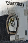
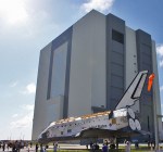
The space shuttle Discovery on Wednesday morning made her first public appearance outside the hangar since being retired, emerging without any main engines, nose thrusters or aft rocket pods. Seeing the stripped down orbiter with a gaping hole in the nose was a harsh reminder that the spaceship’s flying days are over.
(via Discovery leaves hangar to make room for Atlantis – spaceflightnow.com)
Found via ISO50:
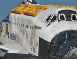
And look at that lettering! I’ve never seen it so close; it has such a handmade feel to it at this scale. The logos and typography of the Shuttle program always intrigued me, they seemed to represent the idea of the United States as a brand, an ideal to be consumed by the rest of the world. Then when Canadarm was installed on STS-2 it became apparent that even other — less crazy — countries felt the desire to push themselves as a brand in space. Of course, pushing your national space-brand became a bit more accessible with the ISS, but the US and Canada used Helvetica and were way ahead of the curve so I’d say they won whatever prize you get for most recognizable space-brand.
(via Discovery: A Visual Eulogy – blog.iso50.com)